Most of us employ Excel to analyze data in search of some insights. For us, this is an enjoyable step. The not-so-pleasing step is the one that follows data exploration: presenting our findings. It is not an easy job to decide which chart-type will depict our analysis in the best possible way to the end user. The problem arises due to varying levels of technical capability across the users of our spreadsheets.
Well, our very own Excel MVP, Jordan Goldmeier, has an interesting suggestion for us. Why not let the end user decide which chart(s) they want to see? Of course, we will make it as easy as clicking a button. Moreover, you don’t need to know VBA to implement this. Hurray!
So, let’s check out the tip.
1 – All the charts!
Instead of choosing between chart-types, create all the charts you think are informative. No need to decide on which chart will be the most useful for the end user.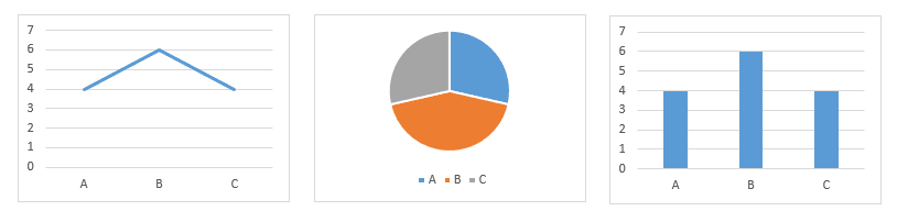
2 – Prepare the dashboard
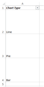
This is an easy step. Just write “Chart Type” or something to this effect in a cell. Now write down the different chart types you want to display underneath it. Now resize those cells to the size of the charts you would want to display.
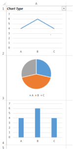
Once you are done with this, add an auto-filter on the “Chart Type” cell from Home tab > ‘Editing’ section > Sort & Filter dropdown > Filter. The overall result should look like that in the image on the right.
3 – Copy and format them
This step is simple:
- Copy the charts to your dashboard, all of them. You can press Ctrl and click on one chart at a time to select them simultaneously. Also, you can use keyboard shortcut Ctrl+C to copy them. And Ctrl+P to paste them in your dashboard sheet.
 While they are all selected, go to Format tab > ‘Arrange’ section > Align dropdown > Snap to Grid.
 While they are all selected, go to Format tab > ‘Arrange’ section > Align dropdown > Snap to Grid.
4 – The boring step…
Now start dragging and fixing these charts exactly into the cells with their names. You will notice them ‘snapping’ to the gridlines. The result should be something like the image on the right shows.
5 – The fun step
Click on the dropdown menu names “Chart Type” and select only the pie chart. Now click OK. Magic, right? The other charts just disappeared, and all you are left with is the chart you wanted to see.
This truly adds a dynamic nature to our charts and makes our dashboards look beyond awesome.
What’s next?
Hungry for more? Try this out and check out other tips too.
And… do not forget to share this awesome tip with your friends and colleagues.
- SSSVEDA DAY 7 – Every Team Needs Someone Who Understands Data - February 18, 2018
- SSSVEDA DAY 5 – When Data Analysis is Wrong - October 31, 2017
- SSSVEDA DAY 4 – Sharing the Excel Knowledge - July 18, 2017
