Mynda Treacy runs a successful online Excel Training program (at http://myonlinetraininghub.com ) with course topics ranging from Power Pivot to Excel Dashboard development.
Mynda joins Excel TV host Rick Grantham and cohosts Excel Author Szilvia Juhasz and Microsoft Excel MVP Jordan Goldmeier to discuss Excel Dashboard Blunders and WWMD??? (What Would Mynda Do?)
First, Excel host Szilvia recaps a dashboard design comment from Steven Few.
Stephen Few says, “Dashboard is a visual display of the most important information needed to achieve one or more objectives, consolidated and arranged on a single screen so the information can be monitored at a glance.”
Let’s look at the following blunders to see if they accomplish that objective.
Dashboard Color Schemes
WWMD?: Mynda says, “Less is more.” Try and use color to create associations between pieces of information. Don’t use too many colors.
Rick: This is the person who paints the outside of the house purple. Purple house. Purple fence. Purple everything.
Takeaway: Microsoft color palettes have gotten better in newer versions of Microsoft office, but don’t go overboard. Pick one or two of your favorite colors and work within that pallet.
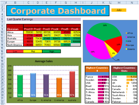
Dashboard Data Overkill
WWMD?: Mynda asks, “What is the message you were trying to convey?” This dashboard has too much information and is too busy. In my course, I teach that before you start building anything ask yourself, “What question are you trying to answer with this dashboard?” That tends to focus attention and narrow the content down.
Jordan: The lesson here I believe is that people want to put all the information on there and let the user decide what they want. But you should build with intention and connect the message.
Rick: The more I see this dashboard, the more I’m confused. Even the title and timelines don’t line up with the graphics.
Sylvia: This should be many dashboards.
Takeaway: This is dashboard data overload.
Infrographic Data Viz Crimes
WWMD?: Infographics are really popular right now with perhaps the thought that designers need to make dashboards look interesting with color and random images slightly related to the topic so people will read it. However, this data visualization doesn’t tell me what is trying to show. A nice bar chart would do.
Is infographics a trend that will go away along with 3-D pie charts? Mynda says they probably won’t go away but maybe they’ll be some design standards that come into being.
Takeaway: Dashboard infographics, like fame, have become cheap.
Doughnut Charts

WWMD?: Aside from it being a Doughnut Chart, the colors are the wrong way around and it’s totally confusing.
Takeaway: It’s just wrong!
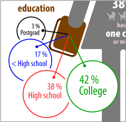
Venn Diagram Messaging Fail
Messaging problems are created with this poorly designed dashboard using a Venn Diagram. (IF it is actually a Venn Diagram!)
WWMD?: This is a fail.
Rick: Points for using the colors correctly!
Final takeaway: Learn some principles on what a Venn Diagram is. And, with all dashboard design, what is the message you’re trying to convey.
3-D Pie Charts
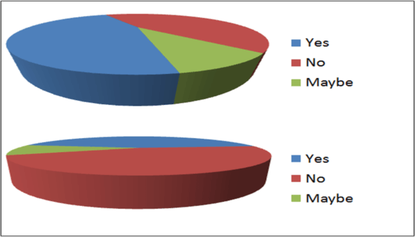
What does the expert Mynda say about 3-D pie charts?
WWMD?: It’s a big NO! 3-D distorts the message. People love pie charts for some reason. I think they are trying to impress their boss who doesn’t know any better. At the Excel Summit, I asked that they take these options out of Excel.
Rick: It’s interesting that things were requested to be taken out of Excel when there are a lot of blogs asking to add things to Excel. Even Chris Macro wrote a blog about this recently, but I could see a segment on things that should be taken out. Clippy is gone. Pie charts should be gone, especially the 3-D charts.
Takeaway: Just don’t use the 3-D pie charts.
Dreaded Gauges
WWMD?: Gauges hog a lot of space and often they don’t have any target. Gauges are awkward and you cannot compare them. You can achieve the same results in a bullet chart and have multiple bullet graphs stacked for comparison.
Rick: This is almost identical to 3-D pie charts 10 years ago. When I was first creating dashboards ten years ago, you had gauges like from your car dashboard, but there comes a point where design principles take over and you realize that this doesn’t give me enough information for how much room it takes up. It’s time is gone.
Szilvia: Gauges don’t do well on mobile devices either.
Jordan: Having recently published a book on dashboards (Dashboards for Excel, 1st Ed. 2015 Edition), Jordan says, “I don’t like them because they take up space, particularly in Excel. It is a lot of work and it doesn’t amount to much. It looks cool until you try to use it.”
Takeaway: Don’t do it just because you can.
Modern Dashboards
Does this dashboard look modern? They all contain some of these faux pas. So what is the deal with these modern dashboards that are using distorted perspectives and infographics? Why is there such a lack of dashboard common sense?
Maybe more people should sign up for Mynda’s course!!!
Jordan: Dashboard designers are usually programmers who have not seen research on data visualization.
Rick: Two things to point out. Number one, technicians are doing this and they are doing what they think people want to see. Number two, is, when you’re pulling images off of the Internet, sales people are using what they think executives want to see; Flashy images, whether they’re useful or not doesn’t really matter.
Final takeaway: What is the message you are trying to convey?
Thank you, Mynda Treacy, for your expert advice and comments on another episode of dashboard rescue.
- Jon Acampora of ExcelCampus.com - October 5, 2017
- Nick Green of EchoXL.com - September 14, 2017
- Ken Puls of ExcelGuru.ca - July 26, 2017
