Those of you who know me, know I’m a huge fan of Stephen Few. (I mean, I had him autograph my copy of Information Dashboard Design!) Few is highly regarded as an expert on data visualization and dashboard design. He is the original designer of bullet graphs.
Bullet graphs are not native to Excel’s chart library. If you want to create a bullet graph, be prepared for some finagling with chart features, layouts, and color. Several Excel blogs have articles about creating bullet graphs. Here’s a list of my favorites:
How to Make Horizontal Bullet Graphs in Excel and How to Make Vertical Bullet Graphs in Excel by Jon Peltier
How to Create Bullet Graphs To Replace Gauges in Excel by Charley Kyd
Excel Bullet Graphs by Chandoo
Bullet Graphs for Excel: A Simple Way? by Matt Grams
In addition, Michael Alexander’s book Excel 2007 Dashboards & Reports for Dummies has several great suggestions regarding bullet graphs. And you might also consider Sparklines in Excel, a free tool that can create bullet graphs (and much more) for you automatically. Finally, if you haven’t attempted making these graphs on your own before, I’d start with Jon Peltier’s tutorials. In my opinion, his are the best. Or, alternatively, you could just wait for my book to come out. (Great idea!) But I don’t blame you if you don’t feel like waiting.
My solution
I’m ready to submit my own solution to creating bullet graphs in Excel. I’ll tell you now it’s an imperfect solution – and there are tradeoffs depending upon what you want to display. You’ll see what I mean in a moment. Basically, my version is a combination of Excel’s Sparklines features and in-cell bar charts.
Here’s how it works. First, you create a series of numbers like I’ve done in the graphic below. These numbers will help form the shaded part of my bullet chart. The basic rule for now is that you need three different groups of three different numbers.
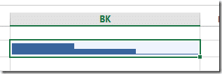
Next, select the entire range and insert a new Sparkline Column Chart (in the Sparklines Group on the Insert tab). Choose a location off to the side in which to place your new chart to take advantage of the full length cell. You should have something that looks like the image below.
If white spaces appear between the columns in your cell, adjust the cell’s column width to a smaller size until the white spaces disappear.
Next, click on the cell so that the Design tab appears in the tab menu at the top. Check both the High Point and Low Point checkboxes in the Show group. Now, staying on the Design tab, select Marker Color (in the Style Group), pull up the High Point color selector and choose a dark shade of green. Click Marker Color again and this time select the Low Point color and choose a very light shade of green. Finally, click Sparkline Color and select a middle-level shade of green. You now see something like this:
From here, we’ll do some axes adjustments. From the Design tab, press the Axis dropdown and select custom value for the minimum value. Type 0 and press ENTER. Now, again, select a custom value but this time click on the maximum value. Type 1 and press ENTER. You should now see a graph like this:
OK. With our shaded regions defined, we’re now ready to do some experimentation.
For a simple bar, we can use the ol’ pipe symbol repetition method, like this. One cool feature of the pipe symbol method is that I can make the bar go in the other direction by changing the alignment from left-aligned to right-aligned. Make sure to try it out in the enclosed example file.
We could also use various symbols as well (as a variation on the on the pipe symbol method). See this article by Jon Peltier for ideas.
If we wanted to insert a target into the chart, we could also insert a line shape like this (now with new colors!):
I’m not a huge fan of this method because it’s not easy to automate. If you have a series of bullet charts all of which have a target of 100%, the line isn’t such a bad idea. You could draw a straight line down across the serie
s of them. But the pipe symbol repetition and shaded regions are all easily defined and changed with formulas. For example, I went back to our original data range and replaced several three’s with two’s to increase the range of the middle region.
One way to make the target-line automated is to create the line out of the Sparkline columns. If I go back to my original data set, I can change it to look like this:
Note that I’ve inserted a one into the series of twos and left the remainder blank. (You don’t need the red font, I just wanted to draw your attention to the difference.) My graph will now look like this:
But if I change the Low Point’s marker color to black, I can make it look like this:

If I move that one in the range, I can make it look like this:
Obviously, I lose the final shaded region with this method. But that might not be a big deal in the end. With some scales and design, the last shade is still visually implied:
One last alternative (see edit!), also not really a favorite, is to use the the pipe symbol for the target and setting the font to a strikethrough style, like this:
I don’t like this method as much because the thinness of the strikethrough line bothers me. But of all the methods presented so far, strikethrough doesn’t require I give up any regions. Also, note, the last region hasn’t been shaded but the region still feels somewhat there.
EDIT!
I don’t know what I was thinking when I posted the strikethrough method. If you use strikethrough, you won’t ever get to a point where there’s distance between your performance measure and your target. I’ve kept it in the in the example file so you can see what I mean. However, you can still get something similar to the strikethrough method by using the dash (“-“) character with the pipe symbol instead.
Thoughts
I really haven’t said anything about scaling – and there are scaling issues! You’ll have to play around with your REPT() formula to figure out how many pipes (or other desired character) can fit in the cell. You’ll then have to figure how much one character unit represents. Finally, you’ll have to ensure your character units align correctly with your Sparkline Column units. For now, I leave that up to you. In the future, I plan to have more applied examples. Until then, you can download this file of examples:
As a bonus, I’ve included this in-cell box and whisker chart:
One last, final point. I’d love to hear your feedback. I still have yet to play around with these charts in full, so I’m not entirely convinced of their usefulness. If you hate them, let me know. If you love them, let me know. Or, if you have other ideas for creating in cell charts using Excel Sparklines, share ‘em!
Also, Stephen Few recently released a new edition of Information Dashboard Design: Displaying Data for At-a-Glance Monitoring, which I highly recommend.
- All Excel LOOKUPs Explained - May 26, 2020
- How to: Power Query File From Folder - April 21, 2020
- Oz’s Excel Tip: Keep a Workbook for Random Data in Excel - January 23, 2020


Hi Jordan,
Its a nice technique, but recently I found another technique to create bullet chart using xy scatter chart.
http://www.excelcharts.com/blog/easy-way-make-bullet-charts-boxplots-excel/
Regards
Sreekhosh
HI Jordan,
This is a nice technique, but i recently found another technique to create bullet chart.
http://www.excelcharts.com/blog/easy-way-make-bullet-charts-boxplots-excel/