On your dashboards, reports, and charts it’s a good idea to alert the user to certain types of values. In a recent post, we discussed how to alert users to certain records on tables using custom formats. We’ll build upon that here but transition to how we might achieve a similar effect on a chart.
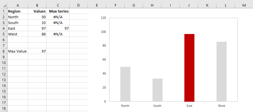
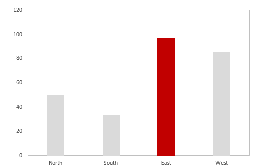
Take a look at the chart in the image below. I’ve built the chart so that no matter what values are being plotted, the greatest value is always highlighted in red. Following similar themes from previous blog posts, I achieved this effect with no VBA. The advantage to not using VBA is that it’s speedy and requires no iteration. On the other hand, for this effect to work, you’ll still need to test if every point is the maximum by using an Excel formula. For small series such as the one shown here, this isn’t really a big deal. But for series with many more points–and more more complex projects–it’s an additional column of data you’ll need to take care of.
Let’s do it!
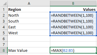
Luckily, the implementation is super easy. So let’s get started. For this example, I needed to create some fake data. So for the values B2:B5, I used RANDBETWEEN. In cell B8, I then find the maximum value that has resulted. (Of course your data won’t be random, but to demonstrate this chart will always pick the greatest value, I use RANDBETWEEN.) The formulas for these items are shown in the following image.
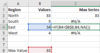
Once we have the maximum value, we need to create a parallel series where that maximum value is the only value that appears. Everything else should be #N/A (or something similar–more on that in the discussion section). We could use zero here, but zero is actually a value on our chart. So it’s better we use something that represents a non-number. NA() is perfect for this. The image below shows an IF formula used in the adjacent column to test whether a specific region holds the maximum value.
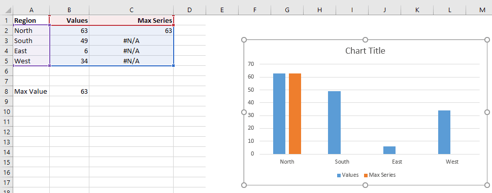
Now, we should have two columns. The first column contains our original data; the second column contains only the maximum number from our original and #N/A’s. At this point, you’re ready to insert a chart. The easiest thing to do is to highlight our data range and insert a new column chart. I’ve done just that below.
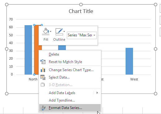
Remember, the values on my screen are being generated randomly, so the orange column may be at another range (or even another color) on your screen. At this point, what we’ll want to do is plot the “Max Series” – the orange column – on the secondary axis. You can do this easily by right-clicking the orange column and going to Format Data Series…..
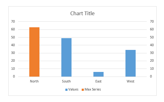
Within the Format Data Series dialog box (Excel 2010 and previous) or context pane (Excel 2013+) go to Series Options and select Secondary Axis. The image below will result.
All you have to do now is some clean up and then you’re finished. Below, you can see I’ve removed an axis and adjusted some formatting.
Discussion
In this simple example, we just used the maximum value, but you could highlight all sorts of values depending upon what you’re looking for. Perhaps you would like to highlight one or more columns whose values are in a specified range; or, perhaps you just want to direct your viewer to the smallest value. Really, the rules are endless but the dynamic is the same. You just need an additional column that parallels the first.
You may have noticed we introduced #N/A errors where a value did not match the maximum value. Generally, having unhandled errors on the spreadsheet can slow things down. (I’m not sure if that extends to generated errors like these, perhaps a reader could verify for me? I would think they make a contribution.) One way around this is to use a number like negative one instead. If you go that route, just make sure you’re only plotting positive data. You could also use a blank text string, “”. I’ll leave that choice up to you, but remember all options come with tradeoffs. Try each out and see which works the best for you.
Download file: Max Chart Highlight
- All Excel LOOKUPs Explained - May 26, 2020
- How to: Power Query File From Folder - April 21, 2020
- Oz’s Excel Tip: Keep a Workbook for Random Data in Excel - January 23, 2020

another application of this technique is discussed in a post i wrote some time ago:
https://usefulgyaan.wordpress.com/2015/01/06/dynamically-highlight-data-point-on-your-chart-without-vba/
I want learn excel so can you share me more excel utilities and VBA utilities