I’ve found a rather obnoxious bug in the version of Excel 2013 that comes with Office 365.
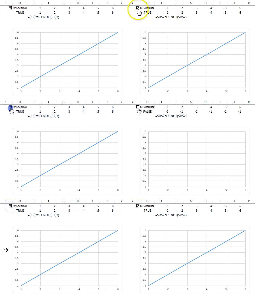
As you know, I’m a big fan of doing stuff with charts. One of my favorite things is to make a dynamic series that disappears based on some user functionality like in the animation below.
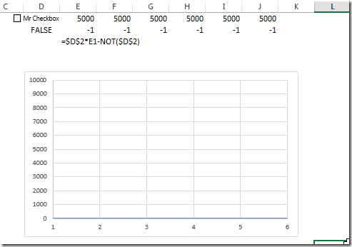
So far so good. Now look what happens when I change the Y-axis scale to a much larger range. Below, I’ve given the Y-axis a range of [0, 10,000]. Now see what happens when I plot a series of –1’s.
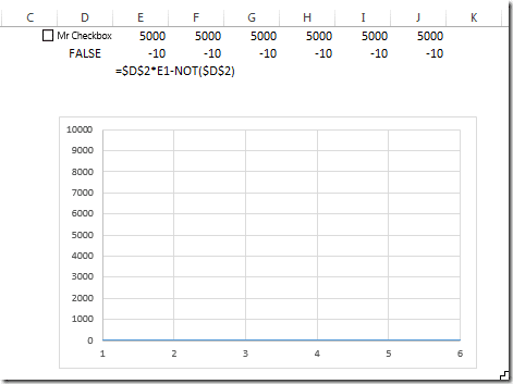
That’s not right. I shouldn’t be seeing the line! And if I change the values to plot to –10, I still see the line…
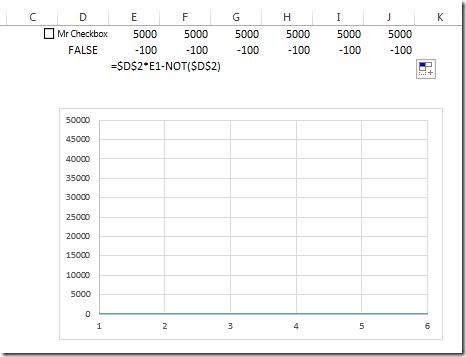
But if I change them to –100, the line disappears…that is, until I choose a larger scale for the Y-Axis.
For good measure, I tried these three exact same scenarios in Office 2010 and had no issues. The line disappeared as expected.
I used Microsoft’s feedback form for Office 365 and let them know what I found. However, I have feeling the feedback form has the same effectiveness as writing your congressmen. Oh well.
—– Edit:
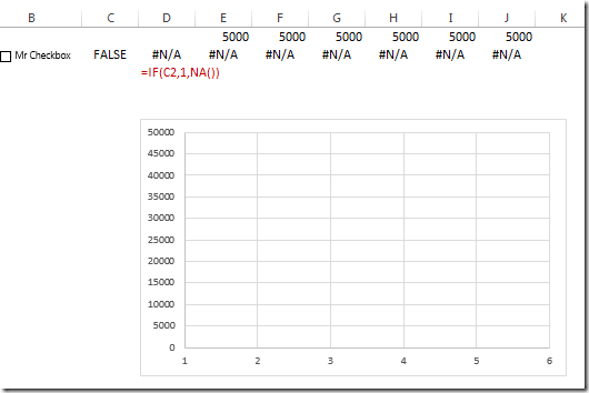
Jon’s comment made me think I should include a way to get around this bug. He mentioned using NA(), which some might argue I should be using anyway. Here’s how to do it. Below, I’ve added an IF formula between the checkbox result and the values I want to display.
If the checkbox is checked, the IF function will return a 1 which is then multiplied by the values across the top making the line reappear. If not, it will become an #N/A which will make the rest of the values become #N/A in turn.
Here’s a challenge: can anyone thank of a way to do this without using IF?
- All Excel LOOKUPs Explained - May 26, 2020
- How to: Power Query File From Folder - April 21, 2020
- Oz’s Excel Tip: Keep a Workbook for Random Data in Excel - January 23, 2020

Use NA() and the line won’t be drawn.
But yeah, it’s a pain. I just reproduced in in Excel 2103, not the one that comes with 365.
Thanks for confirming – NA() does seem like the only way around it.
By the way, can you think of a way of using NA() without also using an IF()?
Jordan:
Type #n/a into the cell, or use the formula =NA()
Ha! Take a look at the addendum to the blog article. I’m wondering if there’s a way to use NA – with the same checkbox functionality designed above – without also using an IF formula (or another conditional formula e.g. CHOOSE, IFERROR… etc.).
Oh yeah, it won’t be dynamic without being in a formula, will it. What’s wrong with using a formula?
Eh, there’s nothing wrong with using IF() here. I’m just always interested if there’s an alternative way to do the same things with Boolean operations. I can’t think of a way for this one.
But I would love it if Microsoft fixed this bug – and, as a bonus, provided the option (in Excel itself) to stop chart animations (would be great if I could save that option to the file). Watching the line animate to the bottom of the chart just amplifies my annoyance with this bug.
A follow-up… After this discussion, I looked into the problem a bit more, and it seems to happen because on a scale of 0 to 10000, a 3 pixel line at -1 is thick enough to appear below and above the axis. Excel is smart enough not to draw the markers that fall off-scale, but it still draws the edge of the line.
This still happens in Excel 2016.