Tired of the same old color palette in Excel?
You know what I mean. Its either Excel Green, Word Blue or Powerpoint Purple. Maybe a few different hues of each color.
But if you are a “designer”, it leaves something to be desired. No self respecting Excel Dashboard designer is showing up with an out of the box palette.
So what do you do?
How do you make the Boss think you know what to do?
Jordan suggests heading over to ColorBrewer2.org Jordan initially picked up this tip from Stephen Few. Stephen is one of the Dashboarding design gurus, his book Information Dashboard Design.
Give your newest Excel design some pizzaz with these steps.

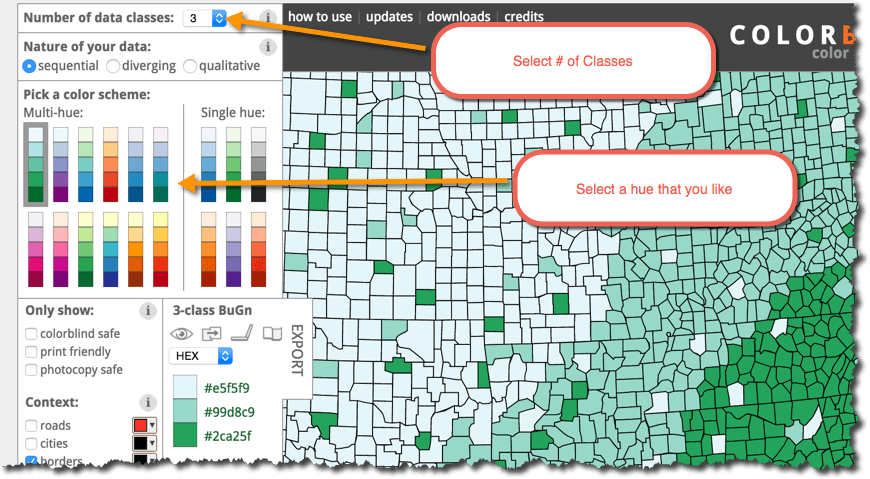
Head over to ColorBrewer2.org
This has to be the easiest step. Just click the link
This helps you create a color scheme for your categorical or ordinal data. What’s that? Categories or ordered data… you know data that is ordered, like first second, third. Huge, kinda big, small.
 Play around
 Play around
Select the number of classes and a hue that you like. Perhaps something that is aligned with your corporate colors.
 Insert the RGB Code into Excel
 Insert the RGB Code into Excel
First off select RGB from the dropdown box is ColorBrewer. Excel likes RGB, so use it.
In Excel, from your home menu (where all the formatting is) select that paint bucket… or fill color… or whatever.
Select More Colors
Input the RGB codes.
These now show up in your recent colors.
Check out Jordan’s Book
Advanced Excel Essentials will question the way you attack your Excel problems. Check it out.
- The Comprehensive Guide to the Excel Ribbon: Making the Most of Your Data - January 31, 2023
- 51: Oz du Soleil & the Global Excel Summit 2021 - February 8, 2021
- 50: Randy Austin – Excel for Freelancers - January 22, 2021
