First off, the PASS Business Analytics Conference 2015 was a blast. Met a lot of great people. I will dig into that further in another post.
Beyond just being there, having a great time, and my Excel TV duties, I was also a speaker. I spoke about larger strategic issues. I had two presentations. Here is a summary of my first one.
Dashboard Requirements Strategy – Tuesday’s Discussion
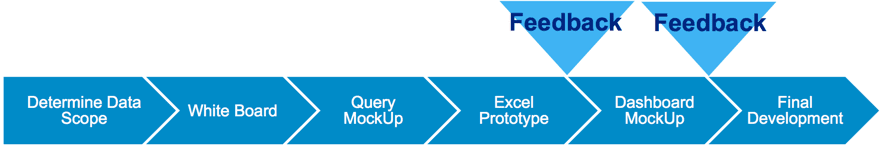
So here is the scenario. An executive calls you into her office. She understands you have some great analytic tools. She just came back from a conference and she is eager for you to build her “some of those cool dashboards.” So what do you do? My 20+ years of doing this sort of thing has taught me to follow these basic steps.
Step 1: Define Data Scope
Most people will miss this first step. Rather, they can’t wait to get a marker in their hands and start drawing on the white board. Please resist this urge. Don’t spend hours and possibly weeks drawing out dashboards for data that you do not have and can’t get your hands on. First define what data is available. This will save you a ton of time later
Items to consider:
- What metrics does the executive want to track?
- What are the measures?
- How does the executive want to slice and dice the metrics?
- What are the dimensions?
- Can the executive define how these should be calculated?
- What system holds each piece of data?
- Is the system easily accessible?
Step 2: Whiteboarding
Before you get too far down the whiteboarding process, take time to understand what type of dashboard that your executive wants to build. This is CRITICAL for reasons that I will explain. In my experience, I see two separate approaches based on what the executive desires.
Strategic Dashboards
REVOLUTION
Tools of the trade: Annual report
This is a “tops-down” approach. Think “Balanced Scorecard”. Where an executive wants his KPIs to cascade through the organization.
Cascading from:
Corporate Vision > to Executive Measures > to Diagnostic reports and an ad hoc environment for analysts
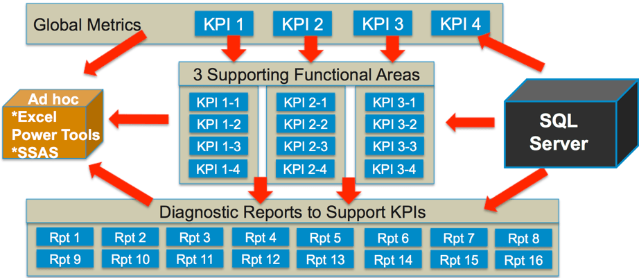
In a strategic dashboard, the conversation typically starts with finding the strategic direction that the organization is heading in (like an annual report) and tying your executive to that strategic direction. Once the top KPIs are selecting, everything else flows downhill from there.
Operational Dashboards
EVOLUTION
Tools of the trade: Starts with summarizing existing operational reports
This is a bottoms up approach. Where reports have been generated for years, and now the executive just wants to “roll these reports up” into a dashboard. The executive is looking for a summary. The model loos like this.
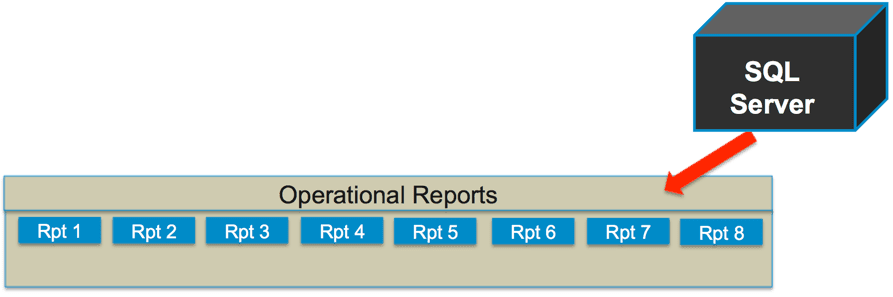
Evolving from:
Existing Operational Reports > to summary dashboard
Gotcha’s
Don’t bring an annual report to a meeting where an executive wants to summarize existing data. I have done this before and it is a disaster.
Don’t summarize existing operational reports if your executive is looking for a Tops Down Balanced Scorecard approach. Bringing operational reports to a dashboard meeting with a big thinker can make you look like to play small ball.
Design Principals
I always look for three things that all successful dashboards have. Look for these during your whiteboarding session.
- Navigation – This is simple enough and it exists in most dashboards. Usually identifiable by tabs across the top, or some intuitive way to navigate the dashboard. This is typically across the top or the left sidebar.
- Criteria Selection – Selecting different months/years. Selecting different Lines of Business, etc. There are a multitude of potential selectors, including radio buttons, drop downs, etc.
- Segmentation – This is the one that sloppy dashboards miss. If you inherited an ugly dashboard, chances are that it is difficult to read because there are multiple criteria selectors and the end user cannot tell which selectors impact which graphics… because there is no segmentation. This can easily be achieved by panels or borders that segment selection criteria with the appropriate graphics
Step 3: Query Mockup
List the data elements that you would need to populate to be able to support the dashboard
- Layout
- Field names
- Formats
- Numbers
- Currencies
- Text
This accomplishes a several things. 1) it provides you with a basis a dummy data to start your mockups 2) and most importantly, it gives your database technical a sample of the data that you require so that she can begin to model the data for you.
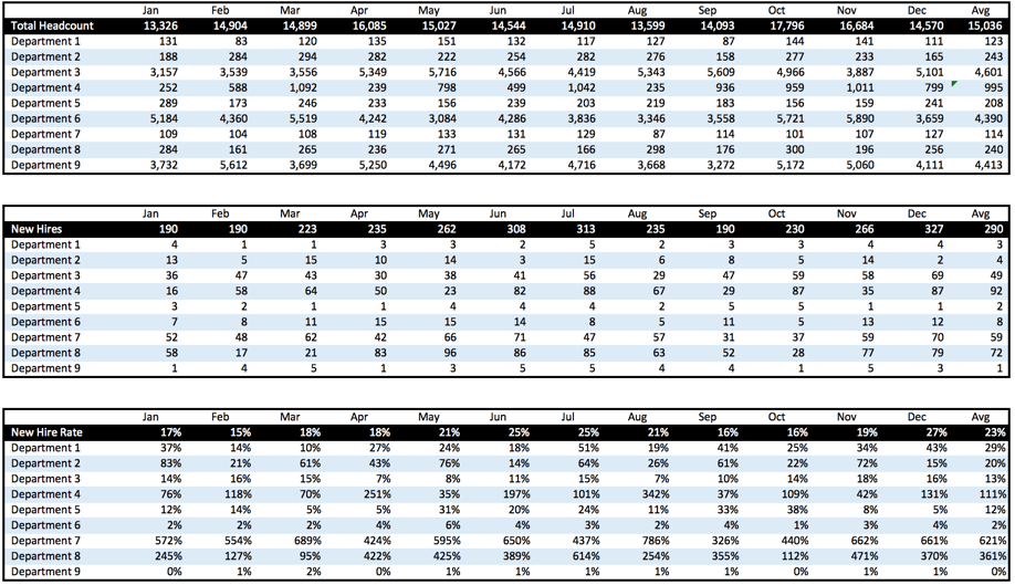
A sample query mockup may look like this:
Sample: Click graphic to download file
Step 4: Excel Prototyping & Feedback
For you Excel analyst, we now have the fun part. grab the query mockup data from Step 3 and the pictures that you took in the whiteboarding session (Step 2) and start to build a prototype in Excel.
A few tricks of the trade:
- Use RANDBETWEEN() formulas so that the data appears to be interactive when executive select dummy data from drop downs
- Use hypertext links in your dashboard navigation tabs so the executive feels they are moving from one tab to the next
- Hide ouput from dropdowns (ActiveX) behind the object. This hides the interactivity from the end user.
- Go to Youtube and lookup TheExcelKid – He has plenty of cook tips on dashboard visuals in Excel
- Use Colorbrewer to determine your color scheme. Jordan has a good tip on using ColorBrewer here
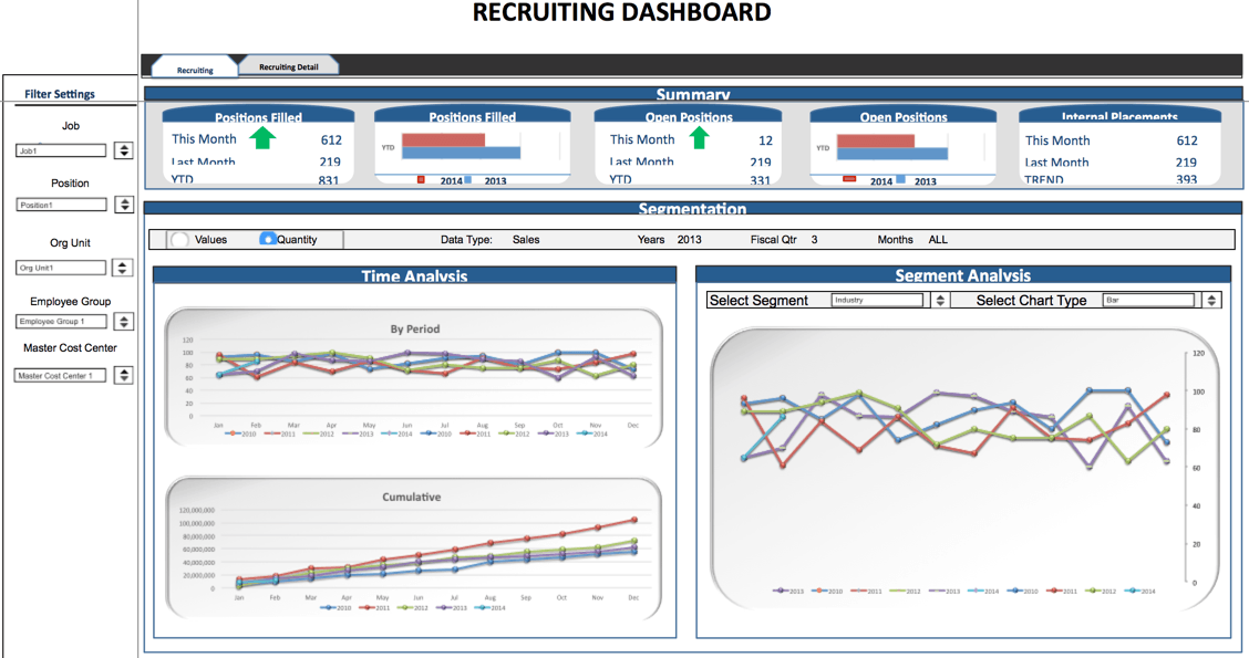
SAMPLE – Click graphic to download file
Step 5: Building Mockups and Feedback
Once you have received feedback from the executives, incorporate that feedback and build a mockup in the dashboarding tool. This may be Excel, SSRS, Xcelsuis, or any dashboarding tool. Once the design is complete, export the file into a format that easily digestible for executives to play with and give you feedback. If possible, I like to export the dashboard mockup into a .swf file. This gives a lot of flexibility to executives to interact with the dashboard.
The mockup below has several elements.
First off, the dashboard is a strategic dashboard, in that higher level metrics cascade to lower level metrics and diagnostic reports.
Secondly, the dashboard is built with an ad hoc element included. So that as executives cascade through the dashboard, they can be “intellectually curious” on their own without the need for an IT professional.
Summary
Here is the process that I have found to be the most useful in designing an effective dashboard
- The Comprehensive Guide to the Excel Ribbon: Making the Most of Your Data - January 31, 2023
- 51: Oz du Soleil & the Global Excel Summit 2021 - February 8, 2021
- 50: Randy Austin – Excel for Freelancers - January 22, 2021

Hi Rick,
Can I ask for a copy of your Data Element Matrix that you displayed in the Making Informed Decisions session? This would be so useful for me and my team when we define the data scope. Thanks in advance. Loved your sessions!
Hi Thuy-
The download link was included in the post. it is the last bit of text before Step #2 in the above post. But you can also get it here. https://excel.tv/wp-content/uploads/data-scope-example.xlsx
And thank you for coming to my sessions. I will add another post for my second session in the coming days.
Rick