We, as data analysts and Excel experts, are always trying to hunt down new and better techniques to create dashboards. Be it in terms of either design or interactivity, there is always something out there which will appeal to us. In the same vein, Excel MVP Mynda Treacy is here to show us some cool tips and tricks to make our dashboards appear more interactive.
So, what are we waiting for?
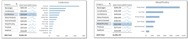
1 – The Dashboard
As depicted in the pictures below, this is something that can serve as part of a dashboard or a standalone, mini-visualization of some data.
There are a few things to note here:
- We all know that the “Category” menu, which allows us to select a food item, is actually a Slicer.
- We can also guess that the graph is a pivot chart, linked to some pivot table the slicer is controlling.
- But it is a bit difficult to guess at the technique used behind making the table in the middle.
Well, let us not make anyone scratch their head on this one. Check out how it was made below.
2 – The Table
As we can see, that table is actually the last two columns of another pivot table. The Slicer was being used to cover up the names of food items in the first column. Also, the monthly data for each item has been hidden. This can be seen from the presence of the grouped columns sign above column O.
The observant amongst would have spotted these hidden columns even without the sign for grouped columns: by looking at the column names. There is no column showing between B and O!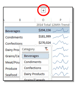
3 – Sparklines!
We know how to add Sparklines. We will just unhide the monthly data, add Sparklines on them and then hide the data again. Well, there is one problem with this method: Sparklines will not display the hidden data!
Don’t sweat! There is an inbuilt option in Excel that can remedy the situation. When we have a cell with Sparklines selected, go to the Design tab, click on Edit Data and then select ‘Hidden & Empty Cells…’. This is shown in the image on the right. Now tick the checkbox on ‘Show data in hidden rows and columns’, and click ‘OK’. Alas, it’s working!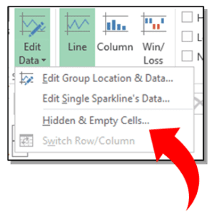
4 – Conditional Formatting
We know now what’s the last step. If anyone didn’t, the title of this section might have given it away. What is the trick behind making the rows of the table highlighted as corresponding food items are chosen from the Slicer. Yes, it’s conditional formatting.
The pivot (bar) chart has a pivot table working behind it. The Slicer is applying filters on it. Within that pivot table if we put ‘Category’ (or whatever the column containing the names is called) as a filter, it will appear at the top.
We would now be able to see that the filter (call it cell X) corresponds to the item selected from the Slicer. So, we can apply Conditional Formatting on the table, to highlight the rows which have the same food item as cell X. Simple, right?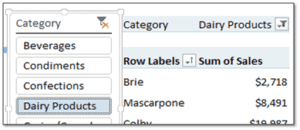
Get the download
- SSSVEDA DAY 7 – Every Team Needs Someone Who Understands Data - February 18, 2018
- SSSVEDA DAY 5 – When Data Analysis is Wrong - October 31, 2017
- SSSVEDA DAY 4 – Sharing the Excel Knowledge - July 18, 2017
