Introduction
I wanted to let you know about a really cool new add in for Microsoft Excel. This is one of those modern add-ins you can download from the Microsoft store.
This add-in can allow you to easily create hierarchy type process maps and flow charts. The free version creates standalone type charts. The paid version, the one Microsoft would like you to buy, connects you to the online Visio service. The idea is that you can create a process map in Excel, automatically generate an editable Visio file, and then integrate that into Power Point.
Today, I'll only deal with the *FREE* version.
How to install the Microsoft Excel Data Visualizer
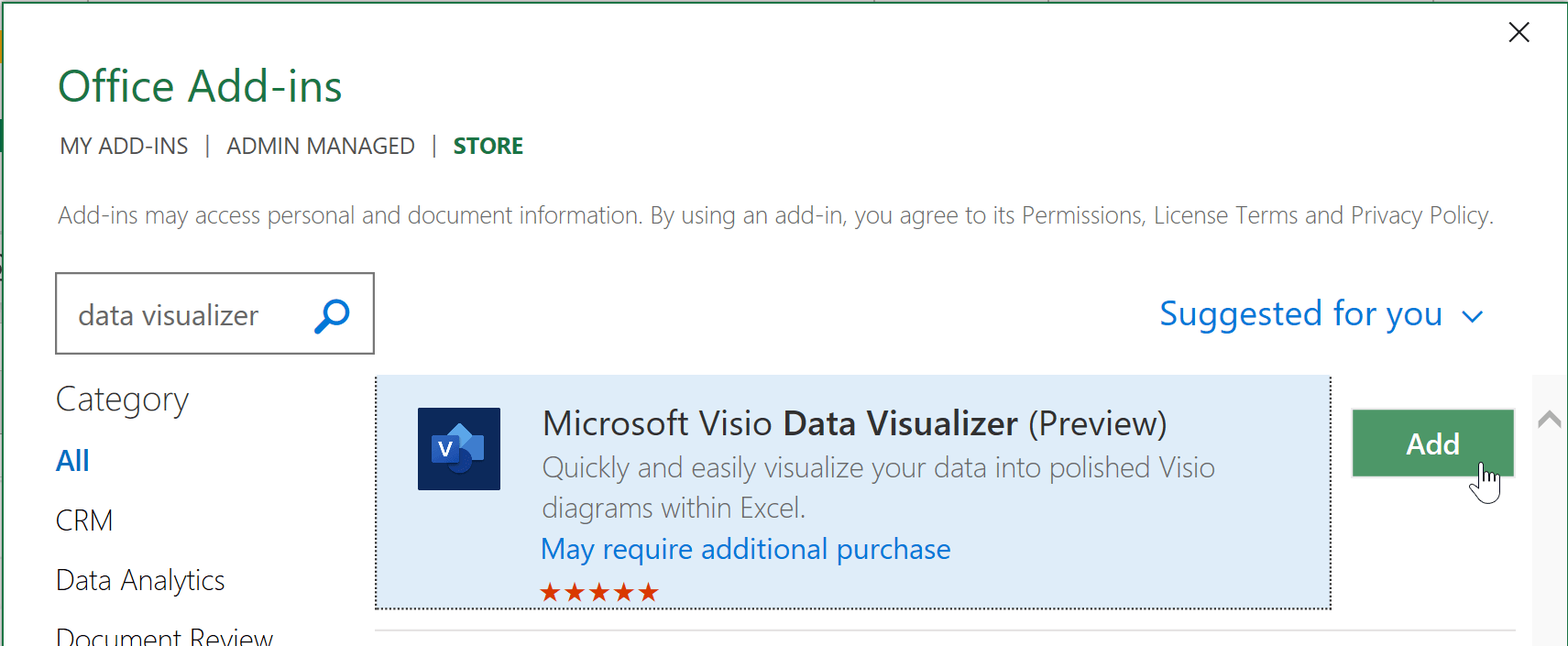
You can install Data Visualizer to your Office 365 installation. Go to Insert > Get Add Ins.
Search for "data visualizer." When you see the Microsoft Excel Data Visualizer tool, select Add.
Once installed, you'll need to login with your Office 365 Account. To gain access.
Inserting a new Visio hierarchy diagram
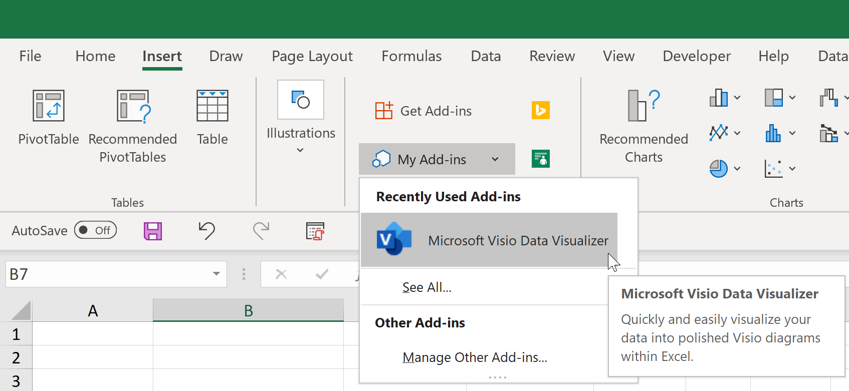
To insert a new diagram, go Insert > My Add-ins and select My Add-ins > Microsoft Data Visualizer.
Diagram Types
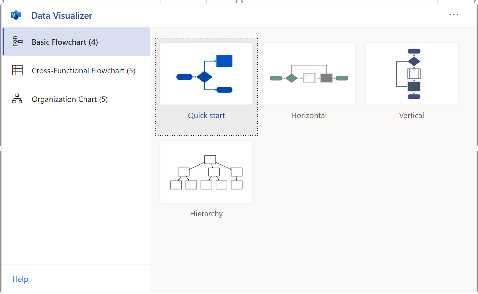
The are three diagram types available.
These types are as follows: Basic Flow Chart, Cross-Functional Flowchart, and Organization Chart.
Basic Flowcharts
Basic flow charts should be used for general flows. Under the Basic flowchart type there are four options:
- Quick Start - Quick start will create a very simple decision diagram
- Horizontal - Horizontal will create a very basic horizontal flow diagram
- Vertical - Vertical will create a very basic vertical flow diagram
- Hierarchy - Hierarchy will create a very simple top-down hierarchy. It will have less features than the comparable diagrams in Organization Chart section.
Cross Functional Flow Charts
There are five default flowchart types for Cross Functional charts. Sometimes these are referred to as "swim lane" charts. Here are the defaults:
- Quick Start - Quick start creates a multiple phase cross functional flow chart with various elements on it. The layout is a bit random but should be enough to help you keep going.
- Horizontal - Horizontal creates a swin-lane chart with multiple phases. That basically means everything will be laid out in a grid but the flow will be horizontal.
- Horizontal (single phase) - Horizontal (single phase) will look like the prototypical swim lane chart. It won't have multiple phases crossing on the other axis. The flow is horizontal.
- Vertical - Vertical creates a swin-lane chart with multiple phases. That basically means everything will be laid out in a grid but the flow will be vertical.
- Vertical (single phase) -Vertical (single phase) will look like the prototypical swim lane chart. It won't have multiple phases crossing on the other axis. The flow is vertical.
Organization Chart
There are five organizational chart types. These charts create hierarchies useful for modeling organizational structures. However, with some additional work, you could adapt the problem to alternate hierarchies. Here are the five chart types:
- Quick Start - This would create a simple bi-level hierarchy
- Vertical - This would create a vertical (root at the top) tri-level hierarchy.
- Horizontal - This would create a Horizontal (root at the left) tri-level hierarchy.
- Side-by-side - This chart would be ideal when you need to organize several people in a hierarchy at the same level. To be honest, I don't really see a true reason for this one. I would recommend using another type.
- Hybrid - This is the one you'll most likely be using to model most complex organizations. With this choice, Excel will take care of the layout vis a vis different levels.
Editing a Hierarchy
I won't go through each type in this guide. However, no matter which type you select, several options are available in each diagram type by editing the Excel table.
Basics of Editing
For the most part, you can edit the following parts of the diagrams: Connections to other Objects, Captions, Object Shape and Color, and Connection Labels.
Editing a Connection
Each object has its own ID. There is usually also another column that includes the potential connections to another object.
The image below shows the object IDs on the left.
Note, this is a basic chart hierarchy example, Next Step ID contains the next items to connect to. Different charts may have a different name, but the concept is the same. To connect to multiple IDs, use a comma.
Editing a Caption
Each diagram allows you to edit one or more captions. In the hierarchy example, you can edit each title by changing the Process Step Description. Again, this column name might change depending upon the chart type selected, but it should be fairly obvious which column holds the information.
Editing an Object Shape and Color
Most diagram options will have a preloaded set of categorical designations. These will change the color and shape of each object. I think some of them follow flow chart norms.
The following example uses an organizational chart layout. In this case, changing Role Type will change the color or shape. If you scroll up, you see the simple hierarchy use the Shape Type column instead.
Editing a Connection Label
You can also edit a connection label in several charts. This will allow you to change the label next to the connection arrow to the next job. If you think of a decision flow diagram, the standard connection labels for a decision are "Yes, No." You'll see columns like Connector Label that will allow you to set the label. If you have multiple connections separated by a comma, each comma separated label will be applied to them respectively. (You can see an example of this in the video above.)
Overview of the Visio Flow Chart
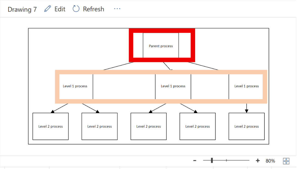
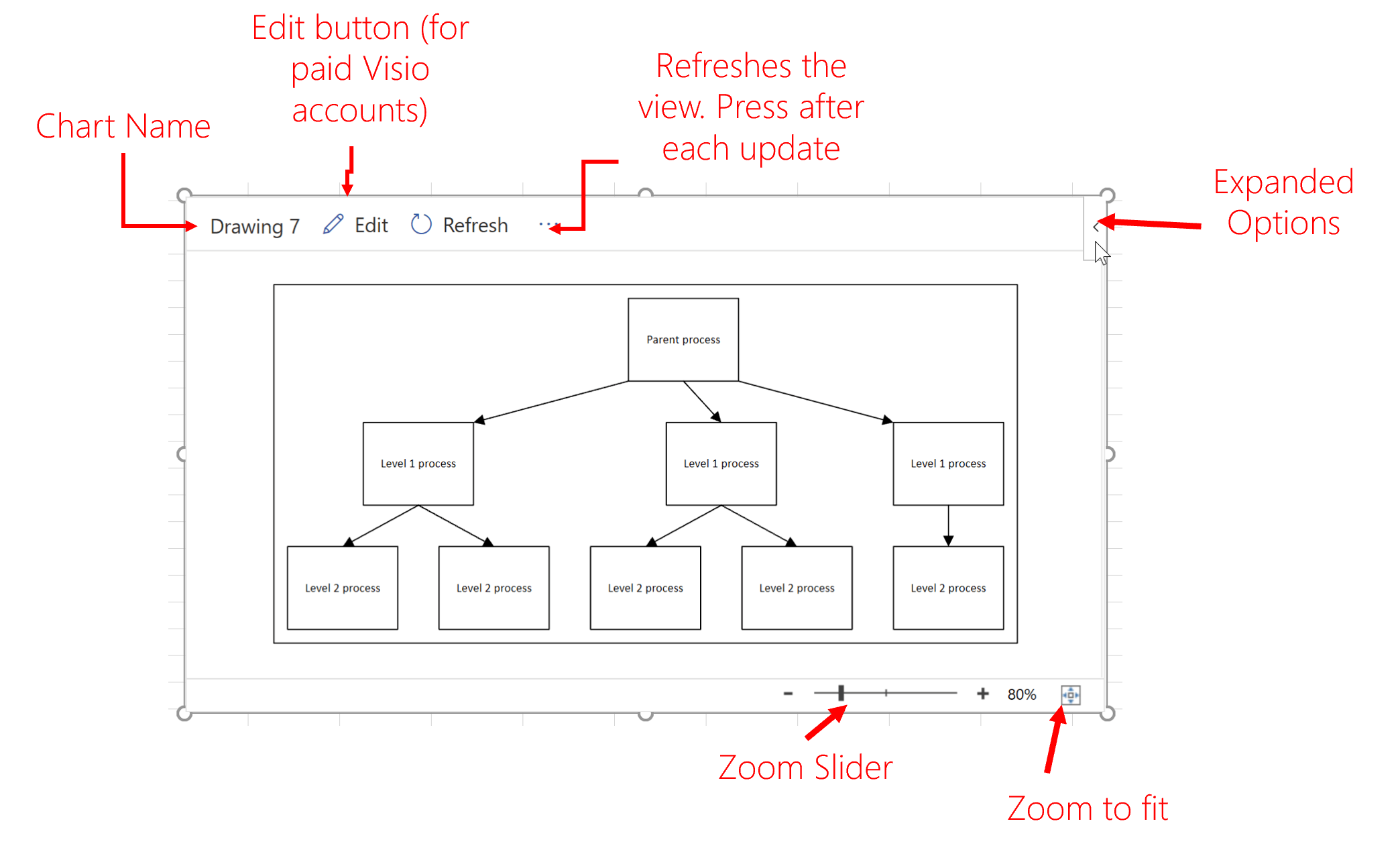
This section provides an over view of the actual flow chart. There are multiple buttons on and interactive items on the chart. The image below provides a description of the layout.
Note that you can edit, refresh, change the zoom level and view expanded options.
Edit Button
This button is a bit of a misnomer as you are able to edit the chart on the spreadsheet itself. However, if you have one of those expanded Office 365 licenses (don't ask me which one, I can barely figure out my current license -- all I know is that it doesn't include Visio), you can actually edi the the file itself as a visio file. That would give you significantly more control over color, fonts, and more.
Again, though, it's only for paid accounts. From what I understand, it'll create a visio file store on OneDrive. That file would be separate from the Excel file but embedded.
Refresh Button
After each change to the Excel table, you'll need to hit Refresh to see the result. I'm told this will be upgraded to automatically refresh. Until the, you'll be clicking this button a lot.
Zooming
You can zoom in and out using the zoom slider. If you want to reset the zoom, you can select the zoom to fit button.
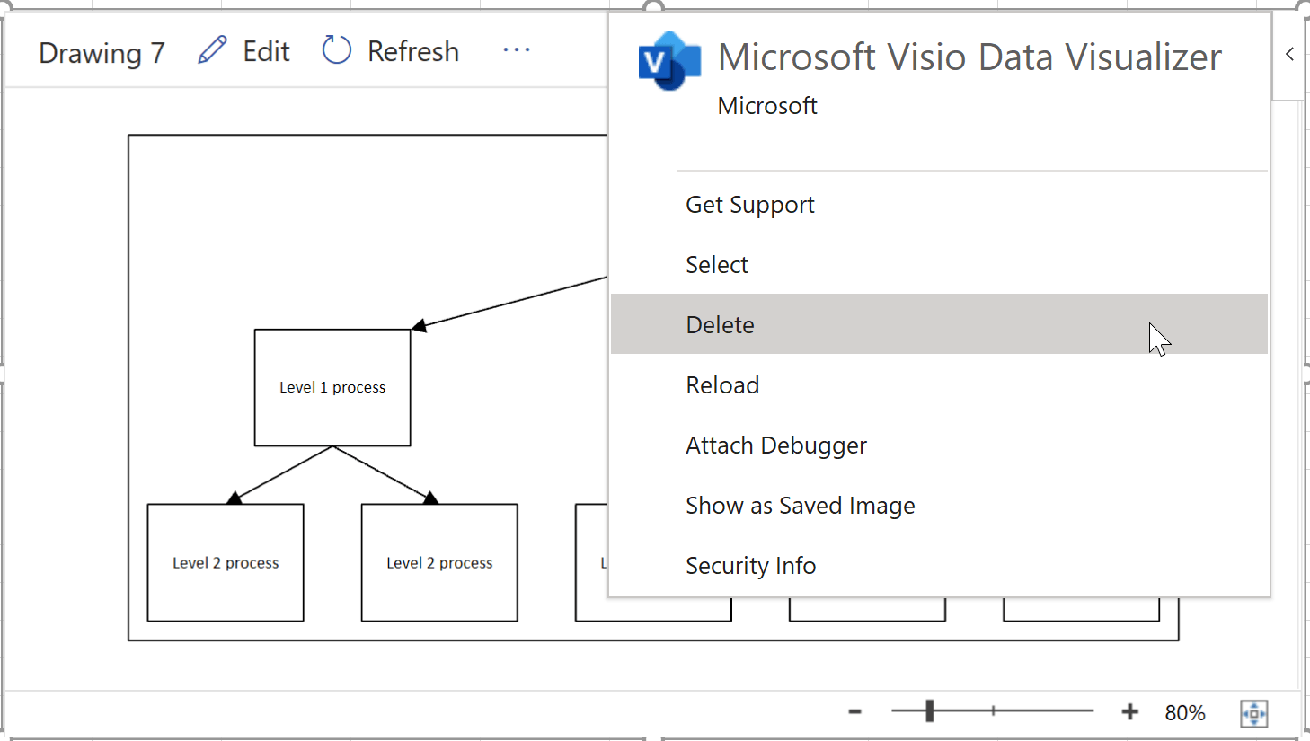
Expanded Options (Delete Button)
The expanded options menu contains additional support items. It's also where you can delete the visio chart if you don't want it anymore. You can also show it as a saved image.
Final Thoughts
Overall I think this is a really cool tool to add. In my video review, I mention that you could use this for much more than organizational hierarchies or flow charts. I could see these being used to create decision trees and modeling conditional probabilities, for instance.
One thing still missing is VBA manipulation. If you wanted to use VBA to create a chart for a user, you'd basically have your macros fill in the required information in the table dynamically. That's about as much programmatic capability I can see for now.
In addition, "data visualizer" is not a great name. Data isn't really being visualized in what we could consider a quantitative display. This is more of a concept mapper.
Still, I think this flow chart is pretty cool. What do you think? Would you use it?
- All Excel LOOKUPs Explained - May 26, 2020
- How to: Power Query File From Folder - April 21, 2020
- Oz’s Excel Tip: Keep a Workbook for Random Data in Excel - January 23, 2020


