Whoever has been tasked with making a dashboard ever knows that there are three aspects to it:
- Business acumen: choosing which metrics are relevant to the problem at hand, amongst other things.
- Technical capability: working out the macros and complex functions to make sure the dashboard is user-friendly.
- Design element: ensuring that the numbers and text are readable, the graphs are popping out and that the dashboard overall looks good.
This third aspect, the designing, seems to be the hardest to nail. There are no rules one can follow to make the dashboard aesthetically pleasing. But there sure are some design trends you can keep in mind for the next time you endeavor making a dashboard. One of such trends is using “white space”.
We have with us Excel MVP Michael Alexander showing us how it is done.
So, what are we waiting for? Let us get started!
1 – Compare Excel Dashboards
Compare the following two dashboard designs and identify which one is better.
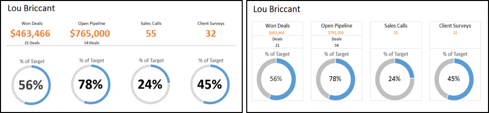
Most people who would prefer the left one over the one on the right. Can you guess which design elements are responsible for this preference? For starters, the one on the left looks cleaner. And this is all because of clever use of what we refer to as the “white space”.
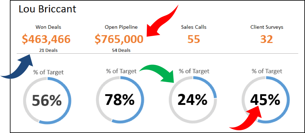
2 – Analysis Of Excel Dashboards
A simple analysis of the preferred dashboard reveals the following things:
- The use of borders is minimal. This makes sure that the white space surrounding different objects in our dashboard is connected and continuous.
- The numbers are bold and bigger so they appear to pop out. This increases readability dramatically.
- The donuts are thinner. This also ensures that there is more white space, which in turn makes the numbers pop out even more.
And there you have it. Some quick tips to make your dashboards look hip!
- SSSVEDA DAY 7 – Every Team Needs Someone Who Understands Data - February 18, 2018
- SSSVEDA DAY 5 – When Data Analysis is Wrong - October 31, 2017
- SSSVEDA DAY 4 – Sharing the Excel Knowledge - July 18, 2017
