
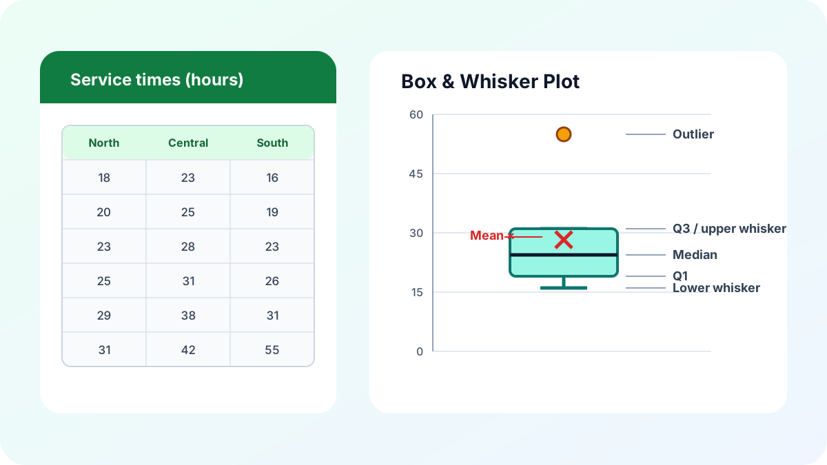
To create a box and whisker plot in Excel, place each group of observations in a separate column, select the complete range, and choose Insert > Insert Statistic Chart > Box and Whisker. Excel calculates the quartiles, median, mean, whiskers, and potential outliers automatically, so you can compare distributions without building helper formulas first.
Documented Excel behavior: Microsoft says its Box and Whisker chart uses Tukey’s 1.5 × interquartile range (IQR) rule to identify outliers. The same Excel team article says the chart was introduced with Office 2016 and that Excel 2016 used exclusive-median quartiles by default. Source: Microsoft 365 Blog, “Visualize statistics with Histogram, Pareto and Box and Whisker charts” (accessed July 24, 2026).
A box plot is useful when averages alone hide the story. Two teams can have the same average delivery time while one is tightly consistent and the other swings from very fast to very slow. The box, median line, whiskers, and dots reveal that difference in one compact statistical chart.
What does a box and whisker plot show?
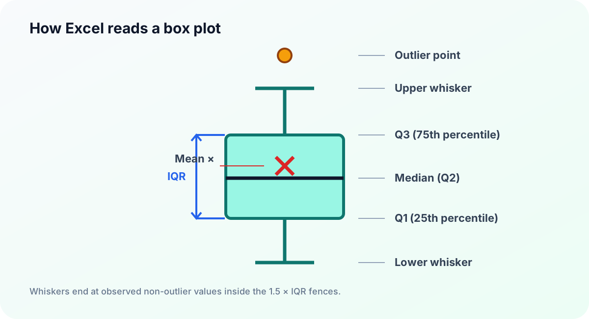
A box and whisker plot summarizes a numeric distribution with five landmarks: the first quartile, median, third quartile, and two whisker endpoints. Excel can also display the arithmetic mean, individual observations, and outliers. It is especially useful for comparing spread, center, skew, and unusual values across several related groups.
The bottom of a vertical box is Q1, or the 25th percentile. The line inside the box is Q2, the median or 50th percentile. The top is Q3, the 75th percentile. The height of the box is the interquartile range:
IQR = Q3 - Q1The IQR contains the middle 50% of the data. A short box indicates that the central half is concentrated; a tall box indicates greater spread. The median’s position also matters. A median near one edge, paired with a longer whisker on the other side, suggests an asymmetric or skewed distribution.
Excel’s whiskers do not always equal the dataset minimum and maximum. They reach the most extreme observed values that remain within the outlier fences. Values outside those fences appear as separate points when Show outlier points is enabled.
How should I arrange the source data?
Put each population or comparison group in its own column, with a short header above its observations. Excel interprets columns as series and creates one box per column. Rows do not need to be sorted, but every measurement must be numeric, comparable, and expressed in the same unit for a meaningful chart.
For example, a support manager could compare resolution times for three teams:
| Team North | Team Central | Team South |
|---|---|---|
| 18 | 23 | 16 |
| 20 | 25 | 19 |
| 21 | 27 | 21 |
| 23 | 28 | 23 |
| 24 | 30 | 24 |
| 25 | 31 | 26 |
| 28 | 34 | 28 |
| 29 | 38 | 31 |
| 31 | 42 | 55 |
Keep raw observations rather than pre-calculated quartiles in the selected range. The built-in statistical chart expects the underlying values. Remove totals, averages, explanatory text, and error codes; otherwise Excel may interpret a summary row as another observation or omit a series.
Different groups may contain different numbers of observations. Leave the unused cells blank instead of inserting zero, because zero is a valid measurement and will change every statistic. If Excel puts observations on the horizontal axis instead of the team names, choose Chart Design > Switch Row/Column.
How do I insert the statistical chart step by step?
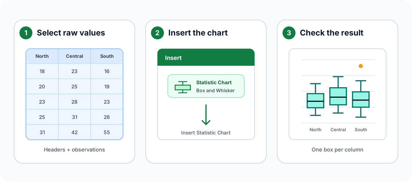
Once the columns are clean, the chart itself takes only a few clicks. Select every header and observation, open the Insert tab, choose the statistical-chart menu, and select Box and Whisker. Then verify the category orientation before formatting, because a polished chart is still wrong if Excel grouped rows instead of columns.
- Select the complete source range, including the group headers.
- Choose Insert on the ribbon.
- Open Insert Statistic Chart in the Charts group.
- Select Box and Whisker.
- Confirm that one box appears for each source column.
- If necessary, choose Chart Design > Switch Row/Column.
- Replace the generic title with a specific title and unit, such as Resolution time by team (hours).
Microsoft’s current Box and Whisker chart guide documents the same Insert path and the available Format Data Series options.
How does Excel calculate quartiles?
Excel’s box plot offers Inclusive Median and Exclusive Median under Format Data Series > Series Options > Quartile Calculation. The choice affects how the lower and upper halves are formed when a series contains an odd number of values. With an even count, the central split does not contain one unpaired median observation.
Suppose the sorted data is 1, 2, 5, 7, 10, 14, 15. The median is 7.
- Inclusive Median includes
7in both halves: lower1, 2, 5, 7; upper7, 10, 14, 15. - Exclusive Median removes
7before splitting: lower1, 2, 5; upper10, 14, 15.
Those methods produce different Q1 and Q3 values for this seven-point sample. Because IQR is Q3 - Q1, the choice can also move the outlier fences and change which points Excel classifies as outliers.
Excel’s QUARTILE.INC(range,1) and QUARTILE.INC(range,3) functions return inclusive percentile-based quartiles. QUARTILE.EXC(range,1) and QUARTILE.EXC(range,3) use an exclusive percentile algorithm. These worksheet functions are useful for auditing, but do not assume their results automatically mirror a chart whose median setting has not been checked.
For a reproducible report, record the selected method in the chart subtitle, footnote, or workbook documentation. The important rule is consistency: do not compare charts created with different quartile settings without explaining the difference.
Where do Excel’s whiskers end?
Excel first calculates Q1, Q3, and the IQR, then creates lower and upper outlier fences at 1.5 times the IQR beyond the box. A whisker ends at the smallest or largest observed value still inside its fence—not at the fence itself and not automatically at the raw minimum or maximum.
The calculations are:
Lower fence = Q1 - 1.5 × IQR
Upper fence = Q3 + 1.5 × IQR
For an exclusive-median example, take 11, 14, 20, 20, 22, 24, 26, 28, 28, 36, 52. Q1 is 20 and Q3 is 28, so the IQR is 8 and the fences are 8 and 40. The lower whisker reaches 11, the upper whisker reaches 36, and 52 is plotted as an outlier. Excel does not draw either whisker to 8 or 40, because those fence values are thresholds rather than observations.
This distinction explains why a whisker may appear to disappear. When Q1 is also the smallest non-outlier, the lower whisker has zero visible length. The same can happen above Q3. It does not mean the chart failed; it means no non-outlier observation lies beyond that edge of the box.
An outlier is a prompt for investigation, not proof of bad data. Verify data entry, units, and business context before removing anything. A legitimate high sale, rare event, or slow case can be the most important observation in the dataset.
How do I format inner points, outliers, and the mean?
Right-click a box and choose Format Data Series to control the chart’s statistical details. Excel can show inner points, outlier points, mean markers, and a mean line. Use these options deliberately: every extra mark adds information, but too many marks can turn a compact summary into a cloud of overlapping symbols.
- Show inner points reveals observations between the whiskers. Use it for small samples where readers should see data density.
- Show outlier points preserves values beyond the fences as individual dots. Leave it on unless the chart has a clearly documented reason to suppress them.
- Show mean markers adds an
Xat the arithmetic mean. This helps reveal skew when the mean and median differ. - Show mean line connects means across boxes in the same series. Use it only if cross-category movement matters and the connecting line cannot be mistaken for a time trend.
- Gap Width controls spacing among boxes. Narrow it enough to compare categories, but preserve separation.
If your analysis also relies on spread around the mean, read Standard Deviation in Excel: STDEV.S, STDEV.P, and Control Limits. Standard deviation and IQR describe variability differently, so they complement rather than replace each other.
How do I interpret a box plot correctly?
Read a box plot in layers: compare medians first, then the central spread, whisker lengths, mean positions, and outliers. Avoid declaring one group “better” from the median alone. A useful interpretation considers the operational goal, sample size, measurement unit, and whether a few extreme observations materially affect the decision.
Ask these questions in order:
- Which median is higher or lower? This compares typical central values.
- Which IQR is smaller? A shorter box means the middle 50% is more consistent.
- Are the whiskers balanced? Unequal whiskers can signal skew or a long tail.
- Where is the mean relative to the median? A displaced mean can reinforce evidence of skew.
- How many outliers appear, and are they plausible? Investigate the source records.
A box plot does not show the full distribution shape. Very different datasets can share the same quartiles, and a box cannot reveal multiple peaks as clearly as a histogram or dot plot. Sample size is also invisible unless you show inner points or label n for each group.
Do not assume the data is normally distributed. Quartiles and IQR do not require normality, and Tukey fences are descriptive thresholds rather than a formal normality test. If you want to express how far an observation lies from the mean in standard-deviation units, use the Excel z-score formula as a separate calculation.
What common Excel box plot problems should I fix?
Most box plot problems come from data orientation, mixed units, hidden summary rows, or misunderstood defaults. Check the source range before changing chart styling. Then verify the quartile method and display options. A one-minute audit of those settings prevents an attractive chart from communicating the wrong grouping or outlier rule.
Excel creates one box per row. Choose Chart Design > Switch Row/Column, or transpose the source so each comparison group occupies one column.
A zero appears unexpectedly. Look for formulas that return 0, text converted to zero, or placeholders entered instead of blanks. A real zero belongs in the analysis; a missing-value placeholder does not.
Outliers disappear. Open Format Data Series and enable Show outlier points. Also check whether the quartile method changed, because that can alter the fences.
The quartiles do not match another application. Confirm whether both tools use inclusive or exclusive quartiles and the same whisker convention. “Box plot” is not one universal calculation method.
The chart ignores filtered rows. Treat filtering behavior as part of the workbook design and test it in the target Excel version. For a fixed report, copy the intended observations to a clean range before charting.
A group has too few values. Excel can render small series, but quartiles and outlier labels become unstable and easy to overinterpret. Report the group’s sample size and avoid strong conclusions from a handful of points.
When should I use another chart instead?
Choose a box plot when you need compact comparisons of center, spread, and unusual values across multiple groups. Choose another statistical chart when the audience needs frequency, sequence, or every observation. The best chart answers the analytical question directly rather than forcing readers to decode a familiar-looking but incomplete summary.
Use a histogram to show the detailed frequency shape of one distribution, including clusters, gaps, and multiple peaks. Use a dot plot or strip plot when every value and the sample size should remain visible. Use a line chart for a genuine time sequence, because a box plot discards chronological order.
A column chart of averages is simpler for an audience that needs only one summary, but it hides spread and outliers. If averages matter, consider showing error bars and state what they represent. Never let readers guess whether an error bar means standard deviation, standard error, a confidence interval, or range.
For small group comparisons, a box plot plus visible inner points often offers a good compromise. Readers get the quartile summary and can still see whether the box represents eight observations or eighty.
FAQ
These answers cover the practical questions that most often arise after inserting the chart: where to find it, what its components mean, why quartile settings matter, and why dots appear beyond the whiskers. Use them as a final checklist before sharing a workbook or exporting the visual to a report.
How do I create a box and whisker plot in Excel?
Arrange each group in its own column, select the headers and numeric values, then choose Insert > Insert Statistic Chart > Box and Whisker. If the categories are reversed, use Chart Design > Switch Row/Column.
What do the box and whiskers mean in Excel?
The box runs from the first quartile to the third quartile, the line inside is the median, and the default whiskers reach the smallest and largest observed values that are not beyond Excel’s 1.5-IQR outlier fences.
Does Excel use inclusive or exclusive quartiles for a box plot?
Excel lets you choose. In Format Data Series, Inclusive Median includes the median in each half when the number of observations is odd; Exclusive Median excludes it. The setting can change Q1, Q3, the IQR, and which values appear as outliers.
Why does my Excel box plot show dots outside the whiskers?
Those dots are values beyond Q1 - 1.5 × IQR or Q3 + 1.5 × IQR. Excel draws each as an outlier point and ends the whisker at the most extreme actual value still inside the corresponding fence.
Can I make a box plot in older versions of Excel?
The built-in Box and Whisker chart is available in Excel 2016 and later. In an older version, calculate Q1, median, Q3, and whisker endpoints in cells, then build a custom stacked-column chart with error bars.
Final takeaway
A reliable Excel box and whisker plot starts with raw observations in separate group columns and ends with documented settings. Insert the native statistical chart, verify its orientation, choose an intentional quartile method, preserve meaningful outliers, and label the unit. Those checks make the compact visual accurate, reproducible, and useful.
Remember the key distinction: the box spans Q1 through Q3, while the whiskers stop at actual non-outlier values within the 1.5-IQR fences. They do not necessarily represent the raw minimum and maximum. Once that behavior is clear, the chart becomes much easier to explain and audit.
