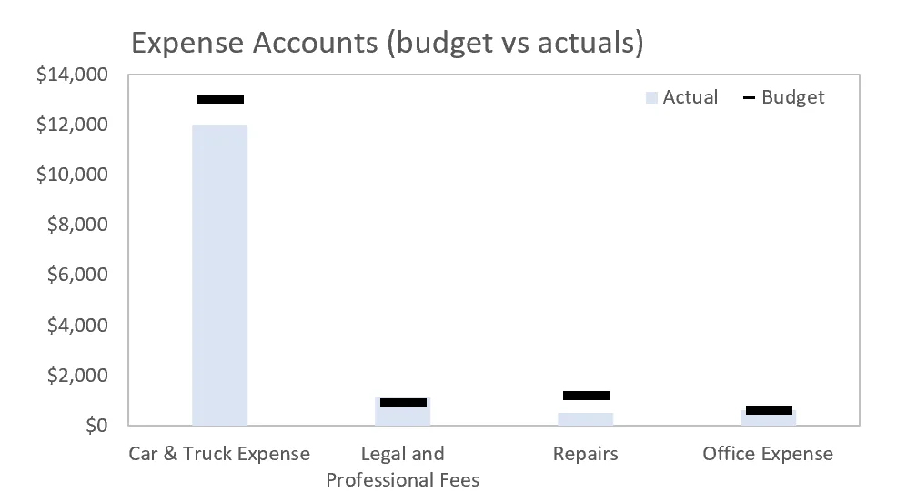
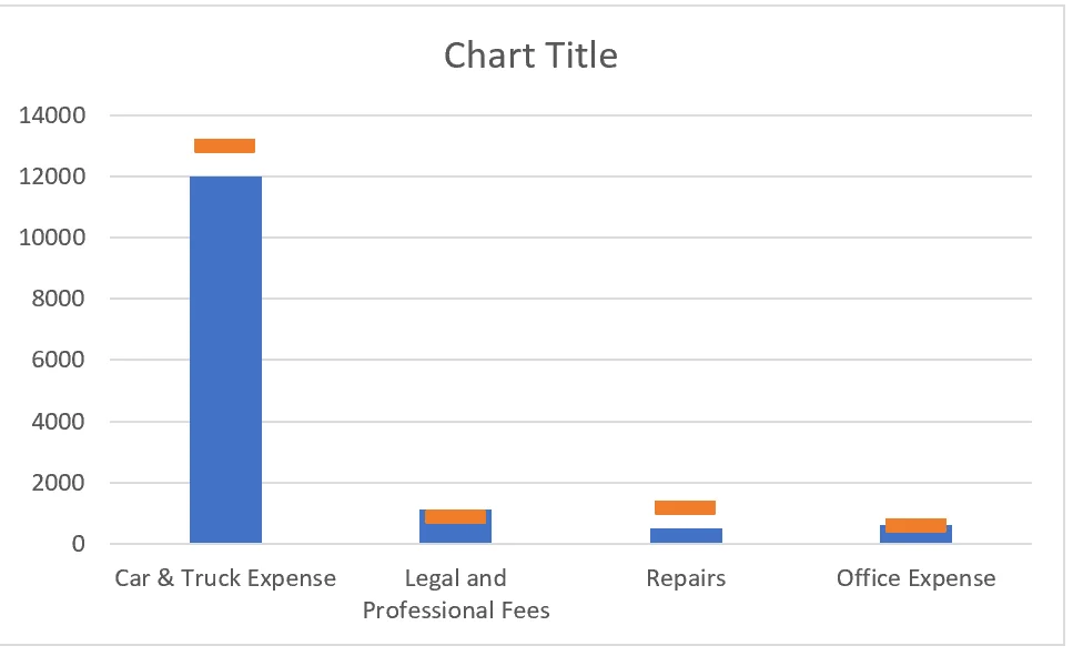
In this week’s episode of Excel.TV, we show you how to build a budget vs. Actuals chart. Really, though, this is what I call in my book Dashboards for Excel a performance-against-context type chart. It basically says: We have what we did against some context (in this case, a target). Take a look below.
In this episode, I show you how to make the chart on your own. It’s a really quick process:
- Start with your data
- Place the data onto the a 2d clustered column chart
- Align the series to be on top of one another
- Change the chart type of your target series to a line chart
- Add markers and remove lines
And that’s about it. The rest is formatting.
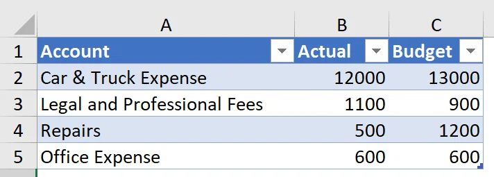
1. Start with your data
In our example file (you can download the file at the end of this post), we start with a list of accounts and their associated actual and budget amounts.
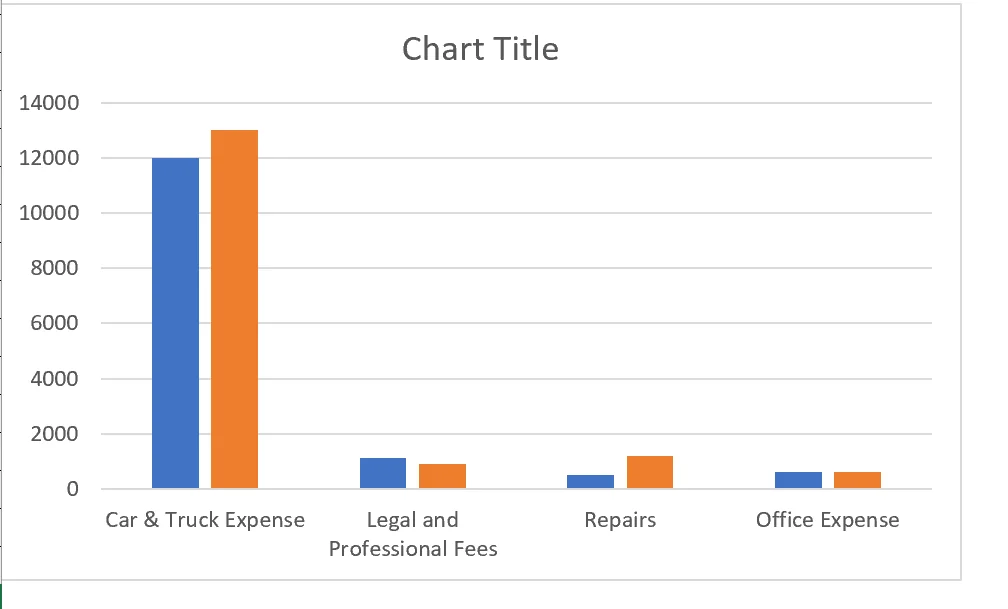
2. Place data into 2d clustered column chart.
We can insert a 2d clustered column chart by going to Insert > 2d clustered column chart from on the ribbon tab.
Once we’ve inserted a blank chart, we can highlight the data in the table above and press CTRL+C to copy. Next, we’ll select the blank chart we’ve just inserted and press CTRL+V to automatically paste the data into the chart.
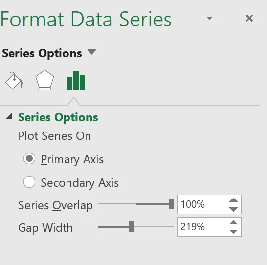
3. Align the series to be on top of one another
Next, we can right-click onto our budget series (the orange one in the figure) and select Format Data Series….
From the Format Data Series context pane, we’ll set the series overlap to 100%.
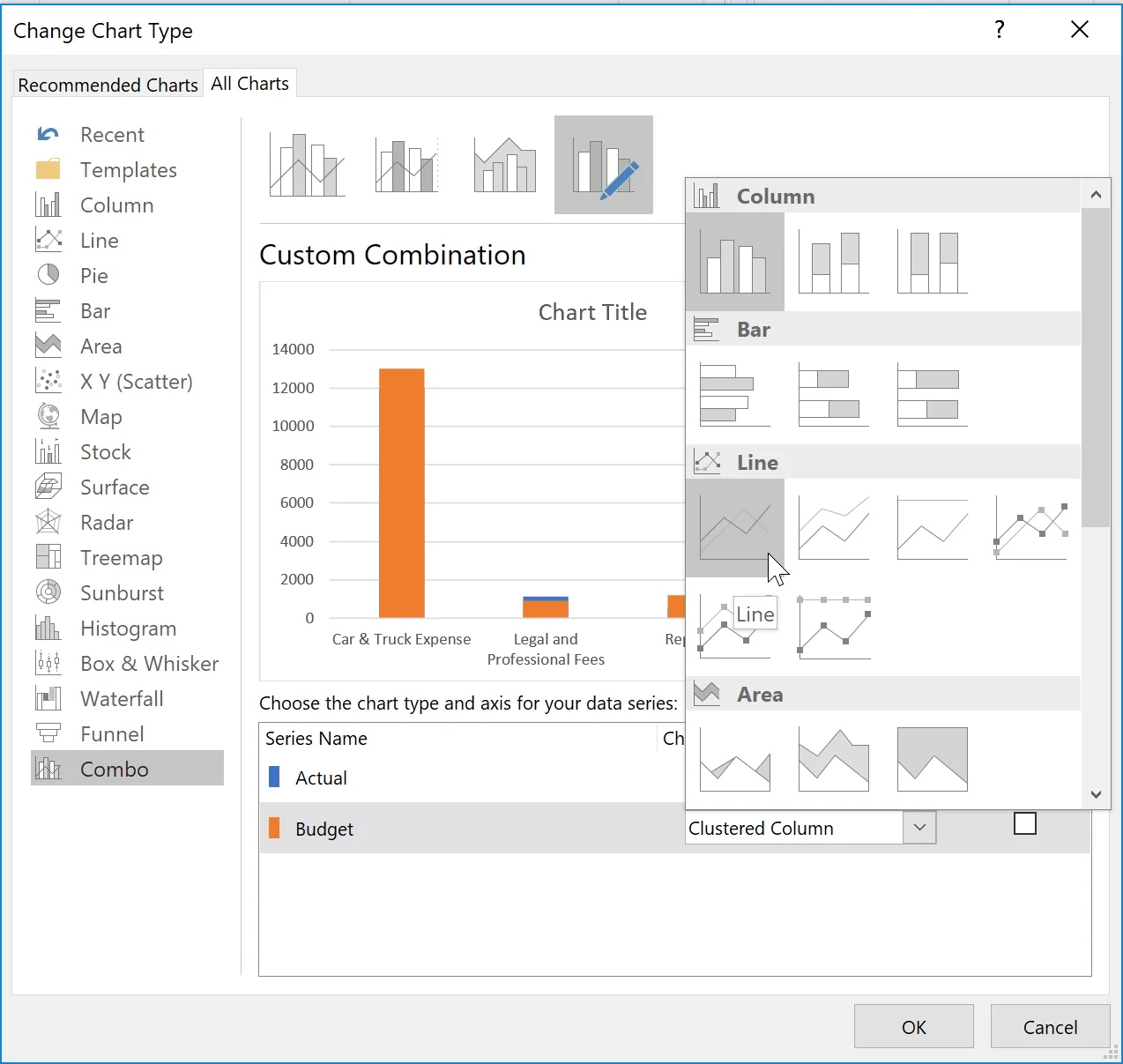
4. Change the chart type of your target (or context) series to a line chart.
From here, we’ll right-click our target series (the orange one in the example) and select Change Series Chart Type….
This will bring up the Change Chart Type dialog box. From here, we’ll change the Budget series chart type to a line.
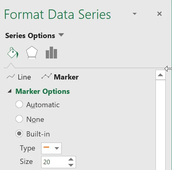
5. Add markers and remove lines
At this point, we’re ready to add markers and remove the lines on the line chart. From here, you can right click the orange line and select Format Data Series….
From in the Format Data Series context pane, select the Paint Bucket icon and then the Marker sub menu. From within the Market Options field you can select built-in, type “-“, and increase the size to something larger as I have in the image below.
You can then remove the line on the chart from the Line menu (click on the Line option next to Marker option – use the image above for reference. From there, select No Line.
And that’s about it! The rest is just formatting!
If you wanted to know how to format the chart like I have, make sure to watch the whole video! And down’t forget to snag the download file.
Download File
Click the button below to get the download file!
Leave a comment!
Could you see yourself using this type of chart? What other types of data could it measure? Let us know what you think in the comments!

Comments (1)
Historical comments preserved from the WordPress archive. Commenting is no longer active.
ok