There are many great articles and tutorials on how to build interactive data displays in Excel. However, there are few articles on how best to effectively display data in Excel. I think this is an important subject that every Excel user should at least think about.
On the other hand, I personally don’t like any set of rules that say this key performance indicator or metric or chart must always be used. If we think about the best books on English, say The Elements of Style, or even the best books on data visualization, say The Visual Display of Quantitative Information, we find neither author posits their principles as hard and fast rules. Rather, they submit a set of guidelines, heuristics to help us test and decide. The Excel developer world should have such guidelines, to which I present the following for effective means of display in Excel [1]:
– Mutual Exclusivity
– Common Interpretation
– Sufficiency
Mutual Exclusivity
Mutual exclusivity speaks to presenting data and metrics whose different meanings do not overlap. I say “meanings,” here, because there may be instances in which metrics overlap, but their meanings do not. Consider a simple income statement. We all know Gross Profit = Revenue – Costs. If we were to ignore meaning when applying the test of mutual exclusivity, we might venture to only include two of these measures, since the third measure is only one algebraic calculation away. (For instance, we could divine Gross Profit in our heads by only present Revenue and Costs.) In this sense, there is surely overlap in all three of these metrics. But in our understanding of business performance, showing all three is the best option because the meaning they impart is separate and independent.
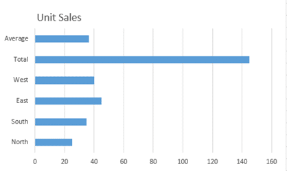
On the other hand, take a look at the following chart.
The addition of a total measure into the Unit Sales chart does little help us divine regional sales differences. Indeed, the total is already plotted to a certain extent – it’s the aggregation of the other regions. Now consider the average measure. The data variation between regions is such that we can gauge the average with our eyes (perhaps not with granularity, but the additional metric does not help us with this either). I argue these two metrics provide an unjustifiable overlap already inherent within the presented regional sales differences. (But you may want to include these metrics for good reason, and we’ll deal with a way to do that by the end of this article.)
Common Interpretation
Common interpretation refers the organizational, institutional, and even societal paradigm through which we understand and interpret data. That may have been a mouthful, but it simply means this: all the people looking at the same metrics must understand them in the same way.
This is especially important for metrics created by and for a specific organization or market. Most of us agree on how to calculate the Current Ratio (we should, there’s really only one way to do it). On the hand, a single organization could come up with its own metric. Consider a performance metrics that results in a score within the boundaries of zero and one. For those familiar with the metric, the results are easy to interpret. But for those on the outside, there may be puzzlement. And unless everyone agrees, placing it on your dashboard or report is sure to generate confusion.
I speak from experience. I’ve watched organizations argue over such metrics and what they mean. When this happens it’s time to take a second look at the measure. Or, consider this scenario: an organization rates its employees once a year. One underperformer receives a 3 out of 5 each year, which according to the company definition of its own metrics is a “good” score. However, compared to his 5 out of 5 peers, he is an underperformer. The employee is fired for underperforming but sues the organization since a 3 out of 5 is considered good on paper. Who’s right? This is an example of an uncommon interpretation.
Sufficiency
Sufficiency speaks to whether there are too many or too few metrics to sufficiently deliver the message required. Sufficiency is related to mutual exclusivity. However, sufficiency deals with the extraneous and insufficient inclusion of metrics. For example, you may find some white space on your dashboard that could be filled in with even more information. If that information doesn’t aid in the understanding of that data already included therein—don’t add it! The whitespace might feel like empty real estate, but not every metric needs a neighbor.
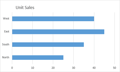
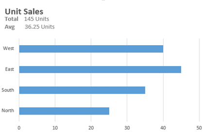
Let’s go back to the first chart presented. Here again, average and total are the problem, but removing them might also present an insufficiency in what information should be delivered. If the aim of the chart is to present the intra performance of regional sales, then the inclusion of these metrics certainly inhibit our understanding. For example, the inclusion of the total requires we stretch the chart range out considerably, thus dampening the variation between each region. But we can still present this information in a way that doesn’t compete with its message while presenting a sufficient amount of information. The chart below demonstrates one such way you could use in a pinch.
Conclusion
The most important thing to remember is that these aren’t hard and fast rules. Consider them as a guide as you continue your Excel journey. As we are now merely scratching of what Excel can do, effective means of data display will serve us well.
————————————————————-
[1] Adapted from the field Value Focused Thinking and quite specifically from the work of Gregory Parnell.
Parnell, G. S., Chapter 19, Value-Focused Thinking Using Multiple Objective Decision Analysis, Methods for Conducting Military Operational Analysis: Best Practices in Use Throughout the Department of Defense, Military Operations Research Society, Editors Andrew Loerch and Larry Rainey, 2007. link
- All Excel LOOKUPs Explained - May 26, 2020
- How to: Power Query File From Folder - April 21, 2020
- Oz’s Excel Tip: Keep a Workbook for Random Data in Excel - January 23, 2020


