There are times when there is a need to cut down on the available data to have a focused view or to make a decision. Or, we might want to create a live tool, such as that for a Dashboard. These are mainly achieved through solutions implemented in VBA in Excel. But … VBA is really not necessary. And Jordan (aka Option Explicit) will be showing us the ‘how’ of this. The result will be a chart controlled by a drop-down list in Excel, which would contain different data categories. You can choose any sort of chart or any tool besides this, and select the data categories as you like.
So, let’s get started!
 The Data
Here’s a sample data set and some other things. We will see how the “other things” will help us create a live, interactive tool. 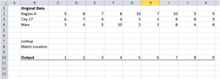
 Lookup
This where you create a drop-down menu, in C7. Go to Data > Data Validation and select ‘List’ under ‘Validation Criteria’. Select B2:B4 under source. This array contains the categories of your data. 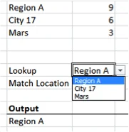
 Match Location
This is where we try to find relative position of the category we choose in C7 from the list of data categories. Insert the formula =MATCH(C7,B2:B4,0) in C8. MATCH takes three inputs:
- The value to be looked up. That’s the value from the drop-down menu, i.e. C7.
- The array of lookup, i.e. B2:B4, our list of categories.
- The match type, for which we select 0 for an exact match.
Note that the location is a relative one, as shown in the pictures. 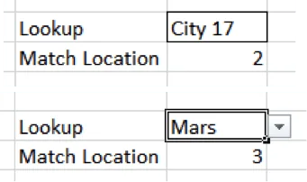
 The Output
Here, the data related to the category selected shows up. Insert =C7 in B11 and =INDEX($C$2:$K$4,$C$8,C10) in C11. 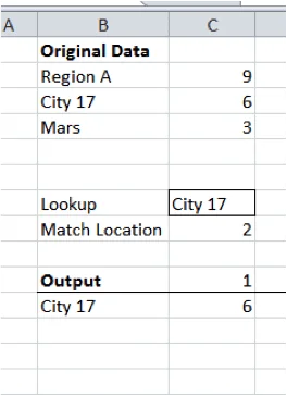 INDEX also takes three inputs:
- Array, C2:K4, which contains the data. Lock it, so we have $C$2:$K$4.
- Row number of the data point we want relative to the selected array. The way data has been arranged, the Match Location (i.e. C8) contains the relative row. Lock this reference as well to $C$8.
- Column number of the data point we want relative to the selected array. This will vary depending upon whether we want the 1st point in the series or 3rd or 10th.
Now drag the formula in C11 to K11.
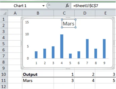
The Result
You will see some data produced this way. Under the selected category in C7, look at the original data set. The two must be the same. You have now created a way to select the data corresponding to the category selected from the dropdown menu. Now select B11 to K11 and Insert > Column Chart. In the graph, select the chart title and type “=” without the inverted commas. Now select the cell B11. And there you have it. A live (chart) tool which can be controlled from the drop-down menu. Notice that the last step ensures that the chart title corresponds to the data depicted in the chart. This is a very neat and cool technique. You can choose to hide away the data rows or have your data in a hidden sheet.