Introduction
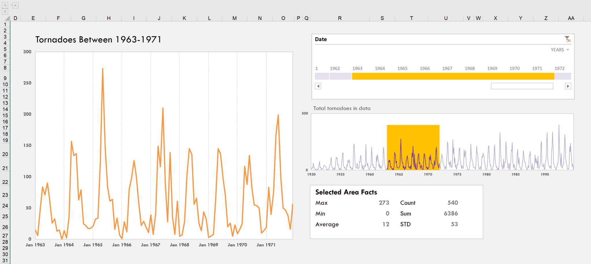
I built a chart that let’s you highlight a series from a smaller chart (take a look at that the chart under the timeline) and show it in more detail on a larger chart. Yahoo! Finance used to have something similar, although I can’t find it anymore. But anyone who has looked up stocks online ought to be familiar with this type of dynamic.
Building this was significant for me in that it accomplished a few things:
- We were able to build a really awesome interactive chart simply using Excel’s internal features and functions. There was NO VBA.
- It uses Pivot Tables. I am not always a huge Pivot Table fan, but I surprise myself sometimes. Although, to be fair, we only use Pivot Tables because of the limitation imposed that slicers can only work on PivotTables.
- Power BI doesn’t (yet!) have something like this. I’m not trying to be the last island still fighting the anti-Power BI war long after the Excel space has moved on. But just remember, if you’re caught in between Excel and Power BI it’s reflective of the current transition. In other words—there are still things Excel can do that Power BI cannot.
So let’s take a look at the mechanisms that drive this interaction. Here are my step-by-step instructions to build this chart.
Step 0 – The Dataset (not really a step?)
The dateset I’m using is a timeseries of the frequency of tornadoes per month from 1945 to 1994. That dataset is incorporated into an Excel table that serves as the backend database for the dashboard.
Step 1 – Placing a Pivot Table
The next step is create a Pivot Table off of this data. Include the date in the Row Values field and the Value in the aggregation field. If you’re using a newer version of Excel, dropping the dates in will create an automatic date hierarchy (see next image).
If that happens, right-click anywhere in the pivot table. And select ungroup.
If everything looks right, your screen should look like this.
Step 2 – Add a Pivot Chart and Timeline
Once the Pivot Table is built, you can add a Pivot Chart and Timeline (Insert > Timeline). In the following picture, I have formatted the Pivot Chart to remove the auto-generated field list options so it looks like a regular chart. Notice that changes in the timeline are now reflective in the chart.
Step 3 – Find out the minimum and maximum dates filtered in the Pivot table.
In our backend data, we create three different values to track:
- The Minimum Date from the pivot table—which is the beginning date of the timeline’s selected region.
- The Maximum Date from the pivot table—which is the ending date of the timeline’s selected region.
- The Maximum Value of the total series—that’s going to be the month with the greatest frequency of tornadoes. We’ll use that to create the highlighted look shown in orange in the first image on the chart showing the full timeseries. We could use any arbitrarily high number, but using the max value of the series ensures we’ll never create a background that’s a lesser height than a given value in the series.
The following image shows how we get the minimum date. We’ll use a similar formula for the max date. The Max value will pull the max from the Excel Table.
Step 3 – Use the original table to create two series that will give the highlight effect of the overall series.
In this step, we create two additional columns to the backend Excel Table: Highlight Series and Highlight Background.
In the Highlight Series column we test if the current date is within the range identified by the timeline. If it is, we have that value returned otherwise we generate an NA() error. NA()s won’t be mistakenly plotted by the chart. You can see in the image (well, just barely, but it’s there!), values outside the range come in as an #NA.
In the Highlight Background column, we repeat the Max Val (399 in this case) where the Highlight Series is not #NA(),; otherwise, we return a zero. I use a Boolean formula to achieve this. Take a look at the next image.
Step 4 – Create the chart by combining Value, Highlight Series, and Highlight Background
At this point, you can create a line chart based on values you’ve been putting together. The continuous time series reflects the Values series; the red highlight can be traced to the Highlight Series column; and, the Highlight Background series is the green that lumps up and forms the highlight.
Step 5 – Convert the highlighted background line chart to a column chart.
Notice that the highlight is currently a line chart and doesn’t look very good. So we’ll neex to fix that.
Right-click onto the Highlight Background series and select Change Series Chart Type. Change the Highlight Background series to a clustered column and then hit ok.
Finally, right click on the Highlight Background series and go to Format Data Series. Set the Gap Width to zero to achieve that continuous effect.
Step 6 – At this point, it’s just a matter of copying and pasting that chart onto your dashboard. Format the chart as you’d like!
Questions? Comments?
Did you like this chart? How would you use it in your work?
What did you think of the video?
As I ask at the end of the video, what kind of video quality are you looking for? Writing these blogs posts are just easier for me sometimes. I like writing more than I like video editing! It’s easier for me on the one hand.
On the other hand, sitting down and just spitting out a video is also really easy. I just struggle because in the age of YouTube, I am suppose to worry about keywords, thumbnails, descriptions and more. I hate doing a million different takes. And I hate that worrying about these things stops me from putting out content.
At some point in the future, Excel.tv will hopefully reach enough training and consulting revenue that I can hire someone to help me build that stuff out. (So please, if you like what we do, share it with your friends, bosses and coworkers—every little bit helps! We’re building a community here!)
But if there’s one thing I’ve realized over this year, it’s just I don’t have the energy for perfection. And to the extent that my perfectionism works against my ability to put out content, I feel worse off.
That said, I want to ensure what I put out is valuable to you. So please let me know what you as a community would like. I love experimenting.
Download File
- All Excel LOOKUPs Explained - May 26, 2020
- How to: Power Query File From Folder - April 21, 2020
- Oz’s Excel Tip: Keep a Workbook for Random Data in Excel - January 23, 2020


Excellent video, as always! The wheels in my brain are already turning with how I could apply this in my job. As for feedback regarding the video, I’m a-ok with the raw and unedited footage. I think it flows very well and definitely accomplishes the task. The only feedback I have is that I am only getting sound on one side (like mono audio). Not sure if that was intended? Just wanted to point that out in the event it was not. Please keep the awesome videos coming!
Really a good idea
Thanks
And congratulations for the channel
Impressive