
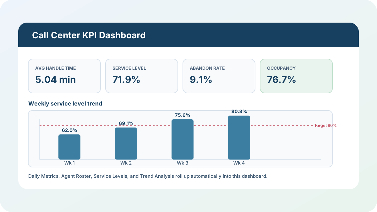
Every call center I’ve worked with tracks the same four numbers — average handle time, service level, abandon rate, occupancy — and almost every one of them tracks those numbers in a different spreadsheet than the one that tracks agent schedules, and a third one that nobody’s updated since last quarter. This call center KPI dashboard is my answer to that: one workbook where daily call volumes roll up into weekly service-level compliance, a trend view, and a one-page dashboard, all from formulas you can actually audit.
Download the call center KPI dashboard — it’s a plain .xlsx, no macros, no external data connections, and no sign-up. Open it in Excel or Google Sheets and start replacing the sample numbers with your own.
Who is this template for?
I built this for a call center supervisor or operations manager who’s currently pulling average handle time from one system, service level from another, and agent handle time from a third, then reassembling them by hand before a weekly stand-up. If you can count calls offered, calls answered, and staffed hours for a day, you can drop those numbers into this workbook and watch service level, abandon rate, occupancy, and the week-over-week trend update without a second spreadsheet. It’s also a solid teaching example if you want to see SUMIFS-driven date-range rollups, AVERAGEIFS across sheets, and a LARGE/MATCH/INDEX ranking working together in one connected model.
What’s in the workbook, sheet by sheet
The workbook ships with six sheets, in this exact order, because each one depends on the sheet before it:
- Instructions — a short setup guide plus a clean-room disclosure: every formula, layout, and sample figure in this workbook was authored from scratch for Excel.TV. No vendor template, workbook, or dataset was downloaded, inspected, or adapted to build it.
- Daily Metrics — the day-level input sheet: 20 sample reporting days across four weeks, with calls offered, calls answered, calls answered within threshold, total talk/hold/wrap time, and staffed hours. Calls abandoned, average handle time, service level %, abandon rate %, and occupancy % calculate automatically for each day.
- Agent Roster — 12 sample agents with team, shift, scheduled hours, calls handled, and talk/hold/wrap time. Average handle time and calls per scheduled hour calculate automatically per agent.
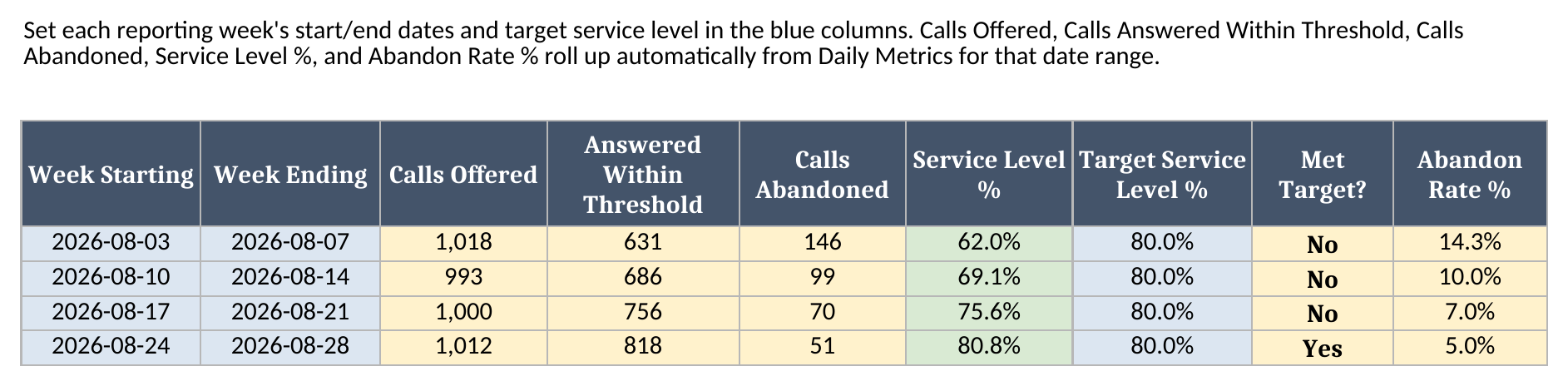
- Service Levels — a weekly rollup: calls offered, calls answered within threshold, calls abandoned, service level %, your target service level %, and whether each week met target, all pulled from Daily Metrics by date range.
- Trend Analysis — week-over-week movement in average handle time, occupancy, service level, and abandon rate, with the point/minute change versus the prior week.
- Dashboard — the one-page summary: total calls, average handle time, service level %, abandon rate %, occupancy %, the weekly service-level trend, and the top three agents by calls handled.
The required inputs are the daily call counts and time totals on Daily Metrics, the per-agent totals on Agent Roster, and each week’s start/end dates and target on Service Levels. The main outputs are average handle time, service level %, abandon rate %, and occupancy % — all of which recalculate the instant you change an input cell.
How do I set up the call center KPI dashboard?
- Open Daily Metrics and replace the sample rows with your own call center’s daily volumes. Enter calls offered, calls answered, calls answered within your service-level threshold, total talk/hold/wrap time in minutes, and staffed hours — don’t type into Calls Abandoned or any of the calculated columns, since those derive from the inputs.
- Open Agent Roster and replace the sample agent list with your own team’s scheduled hours and handled-call totals for the same reporting period.
- Open Service Levels and set each week’s Week Starting, Week Ending, and Target Service Level %. The offered, answered-within-threshold, and abandoned totals pull automatically from Daily Metrics for that date range.
- Review Trend Analysis to see whether service level, abandon rate, average handle time, and occupancy are improving or slipping week over week.
- Use Dashboard for reporting and management review. It pulls from every other sheet automatically, so you shouldn’t type into Dashboard output cells.
Because Calls Abandoned, Average Handle Time, Service Level %, Abandon Rate %, and Occupancy % are all formulas rather than typed numbers, a day with unusually high abandons or an off day for occupancy shows up immediately instead of waiting for someone to recalculate a separate report.
How service level and occupancy actually roll up by week
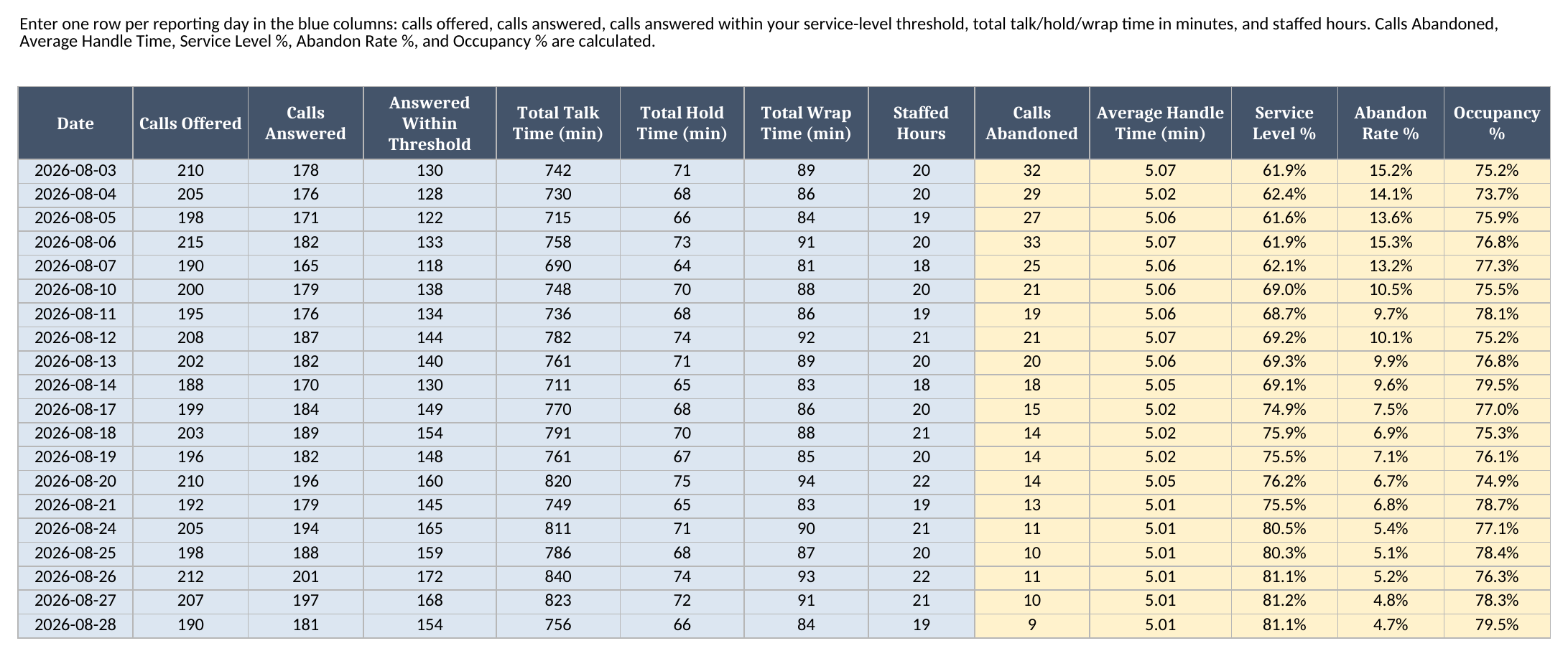
Service Levels is where the date-range math lives, and it’s deliberately built on one pattern repeated across three columns: SUMIFS('Daily Metrics'!range, 'Daily Metrics'!Date, ">="&WeekStarting, 'Daily Metrics'!Date, "<="&WeekEnding). That single SUMIFS shape pulls calls offered, calls answered within threshold, and calls abandoned for exactly the days between each week’s start and end date — no manual re-totaling when a week rolls over, and no risk of double-counting a day that belongs to two different weekly reports.
Looking at the screenshot above, service level climbed from 61.9% on August 3rd to 81.1% on August 28th as calls abandoned per day fell from 32 to 9 — the kind of week-over-week improvement that’s easy to feel anecdotally on a call center floor but hard to prove without a rollup like this one. Trend Analysis takes that same date-range pattern one step further with AVERAGEIFS, averaging Daily Metrics’ per-day Average Handle Time and Occupancy % columns across each week’s date range, so a supervisor can watch handle time and occupancy trend alongside service level instead of reviewing them in separate reports.
Worked example: four weeks, climbing toward an 80% service-level target
I built four weeks of synthetic sample data into the template so you can see this call center KPI dashboard react to a real reporting cycle instead of one static snapshot. Here’s what the workbook calculates for the full August 3–28 period, pulled straight from Dashboard after a full recalculation:
| Metric | Value |
|---|---|
| Total Calls Offered | 4,023 |
| Total Calls Answered | 3,657 |
| Total Calls Abandoned | 366 |
| Average Handle Time | 5.04 min |
| Service Level % | 71.9% |
| Abandon Rate % | 9.1% |
| Occupancy % | 76.7% |
And the weekly service-level trend behind that period total, from Service Levels:
| Week Starting | Service Level % | Target % | Met Target? |
|---|---|---|---|
| Aug 3 | 62.0% | 80.0% | No |
| Aug 10 | 69.1% | 80.0% | No |
| Aug 17 | 75.6% | 80.0% | No |
| Aug 24 | 80.8% | 80.0% | Yes |
None of those numbers are typed in anywhere on Dashboard — every one is a SUM, IFERROR, or date-ranged SUMIFS/AVERAGEIFS result pulled from Daily Metrics and Service Levels. Dashboard’s top-3 ranking uses the same LARGE + MATCH + INDEX pattern I use across Excel.TV’s dashboard templates to surface Dana Whitfield (210 calls handled, 4.90 min average handle time), Marcus Ibe (195 calls, 5.03 min), and Leon Castillo (188 calls, 5.19 min) as the period’s top three agents by volume — without anyone manually sorting the roster.
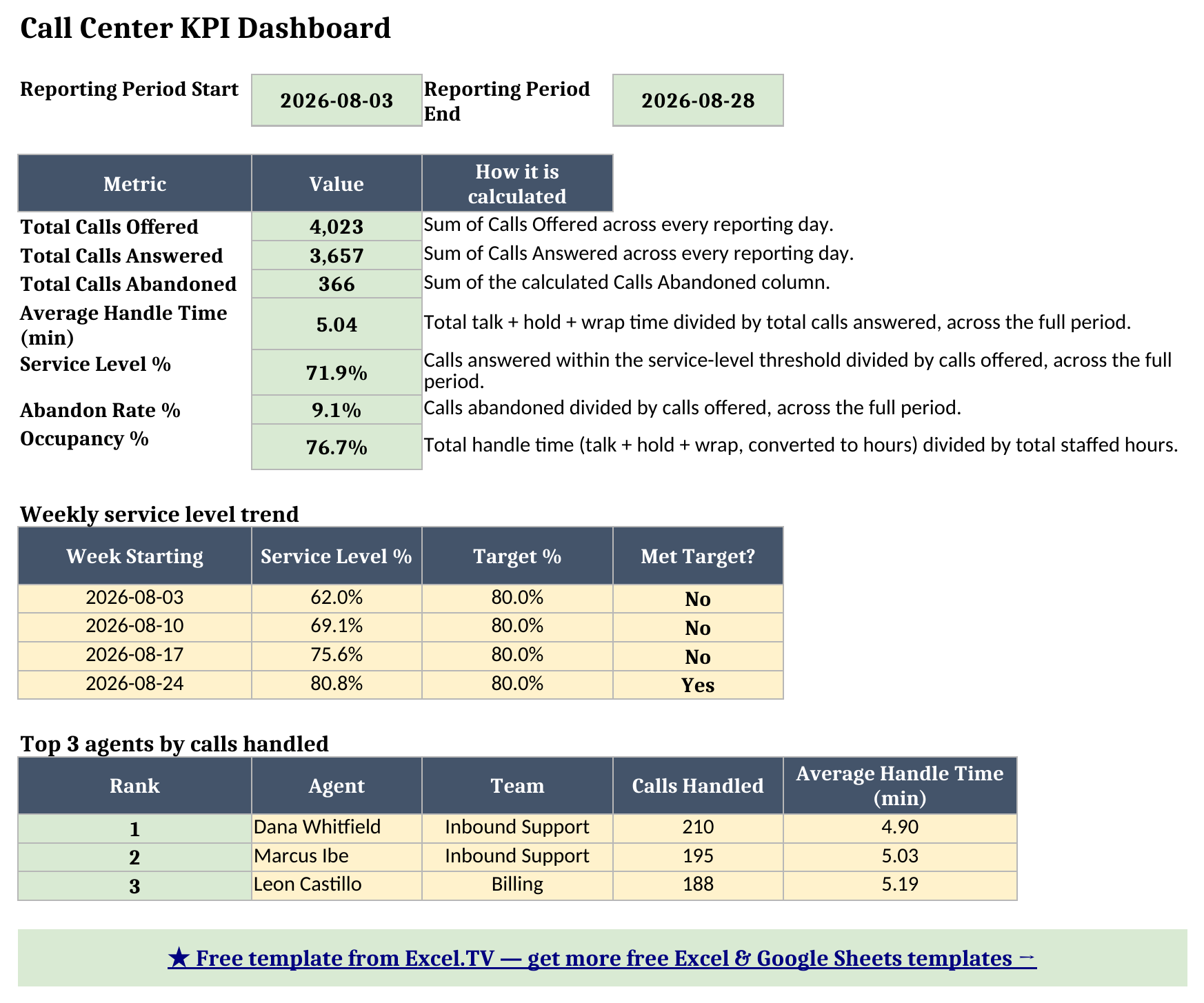
Grab the call center KPI dashboard if you want to change the target service level, add a fifth week, or watch the top-3 ranking react to a new agent’s numbers.
How do I use this in Google Sheets?
Google Sheets is a first-class destination for this call center KPI template, not an afterthought:
- Open Google Sheets and choose File > Import.
- Choose Upload, then select the downloaded
.xlsxfile. - Choose Insert new sheet(s) so all six sheets come in together.
Every formula in this workbook — SUM, SUMIFS, AVERAGEIFS, IF, IFERROR, INDEX, MATCH, MIN, MAX, and LARGE — is natively supported in Google Sheets, so nothing needs to be rewritten, and the Team, Shift, and Status dropdown validation on Agent Roster carries over with it.
Limitations to know before you rely on this
A few things are worth knowing before you put real numbers in:
- Daily Metrics expects exactly one row per reporting day. Service Levels and Trend Analysis both roll up by date range with
SUMIFS/AVERAGEIFS, so a duplicate date or a gap in the sequence will double-count or silently drop a day from the weekly totals. - Service level is measured against a fixed, editable threshold, not a live phone-system feed. “Answered Within Threshold” is a typed input on Daily Metrics — you decide what counts as “within threshold” for your own reporting, and enter it accordingly each day.
- Week ranges on Service Levels must line up with Daily Metrics’ dates without gaps or overlaps. If two weeks’ date ranges overlap, a day’s calls get counted in both weeks’ totals.
- Ties in the top-3 agent ranking aren’t broken. The
LARGE+MATCHpattern that ranks the three highest-volume agents returns the first matching roster row if two agents tie exactly on calls handled. - No macros, no external connections. Everything here is a native formula. That’s deliberate — it’s what keeps the workbook portable between Excel and Google Sheets with zero substitutions.
I’d rather flag these limitations up front than have you discover them mid-reporting-cycle. Once you know the one-row-per-day rule and the non-overlapping-weeks rule, the rest of the workbook takes care of itself.
Download the call center KPI dashboard and start replacing the sample days and sample agents with your own — the weekly rollups, the trend view, and the top-3 ranking will all follow.
