
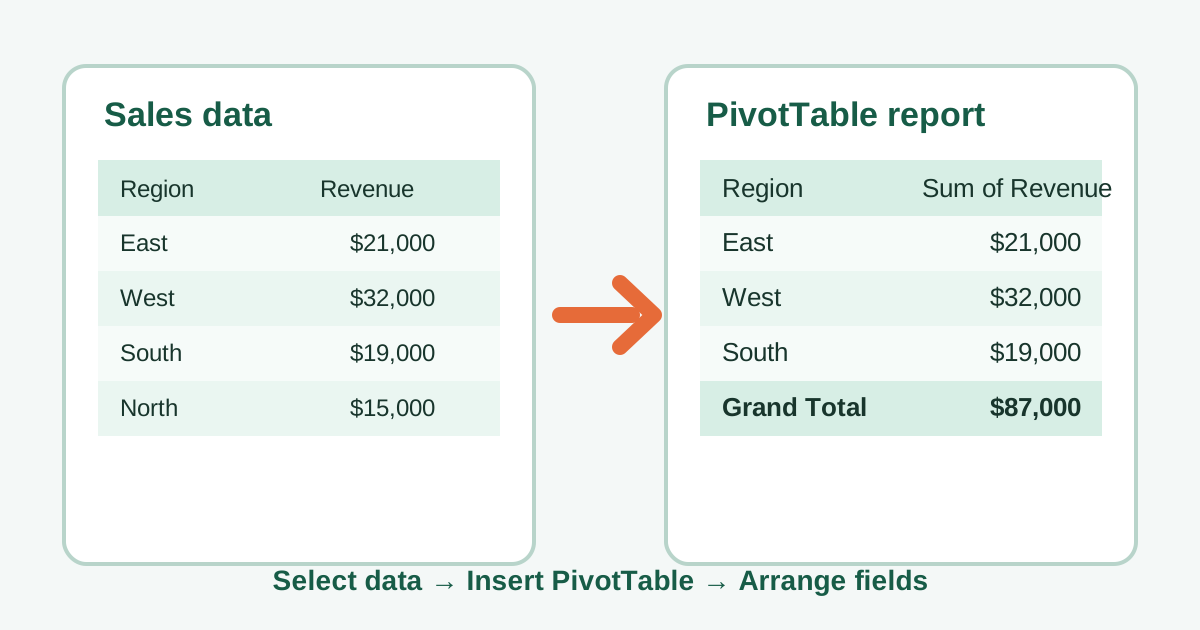
To create a pivot table in Excel, start with a clean list of records and let Excel turn it into a report you can rearrange. This pivot table tutorial focuses on the practical choices that make the first report useful: a reliable source, a clear layout, a sensible summary, and a refresh habit.
Microsoft documents PivotTables as a way to analyze worksheet data from a table or range, an external data source, the Data Model, or Power BI. The walkthrough below uses an ordinary worksheet table because it makes each decision visible. For the broader concept and examples of what this report is for, start with What Is a Pivot Table?.
PivotTable scale fact
Excel’s official specifications allow up to 1,048,576 unique items per field in a PivotTable report. That is a technical ceiling rather than a performance recommendation—available memory and source design still matter—but it shows why validating the source and summary is important. See Microsoft’s Excel specifications and limits.
1. Prepare a source Excel can summarize
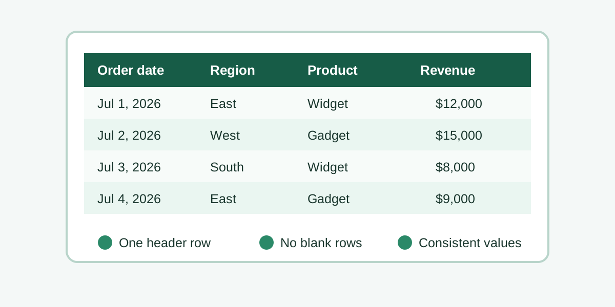
Before you make a pivot table, give Excel a single, continuous source with one header row and one kind of value in each column. Microsoft’s PivotTable creation guide starts by selecting a table or range, so the quality of that selection determines whether the report can group and summarize correctly.
Imagine a small sales export with these columns: Order Date, Region, Product, Salesperson, Units, and Revenue. Each row should be one record—one order line, one support ticket, one transaction, or one survey response. A PivotTable needs this tidy, repeated-row shape because it groups values from one column and summarizes values from another.
Check the source before you begin:
- Keep a descriptive header in every column. Avoid merged header cells.
- Remove blank rows and blank columns in the middle of the data block.
- Put dates in one date column rather than splitting month, day, and year unless that is deliberate.
- Keep numbers as numbers. Currency symbols and commas are fine when Excel recognizes the cells as numeric.
- Use one consistent label for each category.
West,West, andWESTmay become separate groups.
I usually convert the range to an Excel table first with Ctrl+T (or Command+T on many Mac keyboards). This is optional, but it gives the source a name and makes the boundaries easier to understand later. If new rows are routinely appended, a table is also less fragile than a fixed rectangle selected by hand.
2. Select the data and choose Insert > PivotTable
To insert pivot table output, click a cell in the prepared table, then choose Insert > PivotTable. Microsoft’s workflow presents the source and destination choices in this dialog, which means you do not need to pre-select every cell when the active cell is already inside a well-formed Excel table. Microsoft shows this entry point.
If your source is a normal range rather than an Excel table, select the complete block including the header row before opening the command. Excel displays the proposed range in the dialog. Pause here and confirm that it includes the last row and last column you expect; an omitted Revenue column cannot be recovered from the field list later.
The phrase insert pivot table matters because it describes a report creation action, not a formula. You are asking Excel to make a separate analytical view of the source. The original table remains where it is, so you can return to it to correct data or add columns without rebuilding every worksheet from scratch.
At this stage, do not try to solve the layout in your head. Your only goal is to tell Excel which records it may analyze. The field arrangement comes after the report is created, and that separation is what makes a PivotTable quick to change.
3. Put the report on a new worksheet
Choose New Worksheet for a first PivotTable unless you have a strong reason to place the report beside the source. Microsoft’s creation instructions include a location choice, and a separate sheet prevents the expanding report from colliding with raw rows, notes, or formulas already in your workbook.
Click OK and Excel creates a blank PivotTable area plus the PivotTable Fields pane. The blank report is normal. Nothing has gone wrong: Excel is waiting for you to decide what belongs on the rows, what should be calculated, and whether any field should split the result into columns or filter it.
An existing worksheet can be useful for a dashboard, a print-ready report, or a model with a deliberately reserved report area. In that case, choose Existing Worksheet and select a cell with plenty of clear space around it. PivotTables can grow when you add row labels or column labels, so leaving room is kinder to future you.
Treat the destination as a presentation decision. It does not change what data Excel reads; it only determines where the summary appears. Keeping source and report separate is usually the least surprising setup for collaborators.
4. Build the first field layout
Build the first view by dragging fields into Rows, Columns, Values, and Filters in the PivotTable Fields pane. Microsoft’s PivotTable guide describes arranging fields in the report, and this four-area layout is the practical control panel for every question you ask of the same source.
For a straightforward sales report, try this layout:
| Field | Area | Result |
|---|---|---|
| Region | Rows | One grouped line for each region |
| Revenue | Values | A numeric summary for each region |
| Product | Columns | A side-by-side product comparison |
| Order Date | Filters | A quick way to limit the report to a period |
Start with just Region in Rows and Revenue in Values. That creates the simplest useful question: “How much revenue came from each region?” Next, add Product to Columns if you need the answer broken down further. If the report becomes too wide, remove the column field and place it in Filters instead.
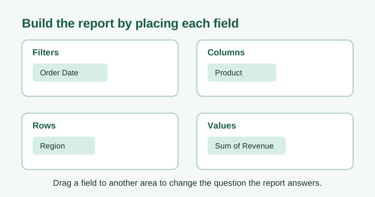
There is no permanent “correct” layout. Moving a field from Rows to Columns rotates the report; moving a field into Filters narrows it. That ability to rearrange the same source is the reason a PivotTable is more flexible than a manually typed summary table.
5. Choose the right calculation in Values
The Values area controls the calculation Excel applies to each group, so verify it before trusting the report. Microsoft’s PivotTable workflow includes summarizing source data in a report; in practice, the important choice is whether your question needs a sum, count, average, minimum, or maximum.
For Revenue or Units, Sum is usually the right default. For a text field such as Customer Name, Excel often uses Count, which answers “how many records?” rather than “how much?” An Average can be useful for order value, satisfaction score, or delivery time. Min and Max can reveal the smallest and largest value in each group.
To change the calculation, click the field under Values, choose Value Field Settings, and select the summary you need. Read the resulting label carefully: Count of Revenue is a very different result from Sum of Revenue. If you expected a sum but see a count, inspect the source cells for text-formatted numbers, blanks, or non-numeric characters.
For percentages, use a numeric source such as Revenue and choose an appropriate “Show Values As” option only after the basic total is correct. First make the report truthful; then make the comparison convenient. A percentage of a wrong total is still wrong.
6. Filter, sort, and format the report for reading
Once the first totals look right, use filters, sorting, and number formatting to make the answer easier to read without changing the source. Microsoft’s PivotTable documentation treats the PivotTable as an analysis report, so presentation changes should clarify the analysis rather than disguise its scope.
Put a field in Filters when one control should limit the entire report. For example, filtering Order Date to a single year lets you compare regions without mixing periods. You can also filter a row-label field directly when you need to focus on one product family or exclude a test category.
Sort the largest results to the top when you are looking for leaders, or sort alphabetically when people need to scan for a known category. For money, apply a currency format with sensible decimal places. For counts, use a plain number format. Formatting is not just cosmetic: a report that clearly says $42,800 is easier to interpret than one that says 42800.
Keep Grand Totals visible while you learn. They are a useful sanity check against the source data. If the total seems surprising, filter down to one category and compare a few source rows before adding more fields or more sophisticated calculations.
7. Confirm the PivotTable refreshes when the source changes
Refresh behavior depends on your Excel version, source, and settings. Microsoft says newer Excel versions can automatically refresh PivotTables connected to local workbook data, but currently limits PivotTable Auto Refresh to Microsoft 365 Insiders. Older or unsupported versions require manual refresh or refresh-on-open. Microsoft’s current refresh guidance explains both paths.
The broadly available method is to right-click inside the PivotTable and choose Refresh, or use the PivotTable Analyze tab’s refresh command. Excel then rebuilds the summary from the available source. You can also enable Refresh data when opening the file in PivotTable Options. If the report uses an Excel table as its source, newly added rows are more likely to fall inside the table automatically; with a fixed range, check whether the source reference needs to expand.
If your Microsoft 365 Insider build exposes Auto Refresh, new PivotTables connected to local workbook data have it on by default. Microsoft notes that the setting applies per data source, and a new PivotTable sharing a source with an existing PivotTable whose Auto Refresh is off will inherit the off setting. Check the control rather than assuming it is active, particularly before handing the workbook to someone on another release channel.
Refresh is also a diagnostic tool. If a newly added category does not appear, inspect the source table for blank rows, inconsistent labels, or an excluded range. If a corrected number does not change the total, make sure you refreshed the correct PivotTable rather than a similar report on another sheet.
For a workbook that other people edit, add a small note near the report: “Confirm refresh after updating source data.” It saves a surprising amount of confusion, especially when a dashboard looks polished but is actually summarizing last week’s rows.
8. Troubleshoot the first PivotTable before adding complexity
When a first PivotTable looks wrong, simplify it to one row field and one value field, then verify the source before adding more layers. Microsoft’s official creation guide centers the report on its selected source and field arrangement, so most beginner problems trace back to one of those two inputs.
Here are the common fixes:
- Everything is counted instead of summed: Check that the source field contains real numbers, not text that only looks numeric. Then choose Sum in Value Field Settings.
- A new row is missing: Refresh, then confirm the source range or Excel table includes the new row.
- The report has duplicate-looking categories: Clean extra spaces, spelling variations, or inconsistent capitalization in the source labels.
- The report is too wide: Move a field from Columns to Filters, or remove it until the core question is clear.
- The total is not believable: Filter to one group and compare it with the underlying rows before changing formulas or formats.
The best way to learn is to make one small, reversible change at a time. Drag a field, observe the report, and drag it back if it does not answer your question. That is far safer than editing the source data to force a layout.
Next steps after your first pivot table
After your first report works, save the layout as a repeatable starting point and build outward only when a new question requires it. Microsoft’s PivotTable creation documentation shows the tool’s supported source options, while the simple table-or-range workflow here is the best base for experimenting safely.
Try duplicating the PivotTable onto another worksheet before making a major variation. One copy can show revenue by region; another can show units by salesperson. Because both reports can use the same source, you do not need to maintain duplicate data blocks.
As your reports grow, learn these additions one at a time:
- Group dates into months, quarters, or years when your source contains real Excel dates.
- Add a report filter for a single period, region, or product family.
- Use a second Value field to compare revenue with units or count of orders.
- Apply a number format that matches the meaning of each measure.
- Refresh every connected report after source updates.
For the concepts behind the workflow, return to What Is a Pivot Table?. For specialized follow-ups, Numbering Grouped Data for Pivot Tables explains a useful source-preparation pattern, and Excel Weighted Average Pivot Table covers a more advanced summary calculation.
FAQ
These answers recap the decisions that matter most when you create a first report: a clean source, the right value summary, and a verified refresh behavior after data changes. Microsoft’s PivotTable refresh guidance distinguishes manual refresh, refresh-on-open, and the newer Auto Refresh feature.
How do I create a pivot table in Excel?
Select a clean data range, choose Insert > PivotTable, confirm the source and destination, then arrange fields in Rows, Columns, Values, and Filters. Start with one row field and one numeric value field before making the layout more detailed.
What data should I use for a pivot table?
Use a contiguous range with a header row and consistent values in each column. Each row should represent one record. An Excel table is often a practical source because its boundaries are easier to manage when data grows.
Why is Excel counting instead of summing in my pivot table?
Excel commonly counts a field when it sees text rather than numbers. Check the source cells, convert any text-formatted numbers, refresh the report, and choose Sum in Value Field Settings if a sum is the intended calculation.
Do I need to refresh a pivot table?
It depends on your Excel version and settings. Auto Refresh for PivotTables connected to local workbook data is currently available to Microsoft 365 Insiders in newer Excel versions. In older or unsupported versions, refresh manually or enable refresh when the workbook opens.
