
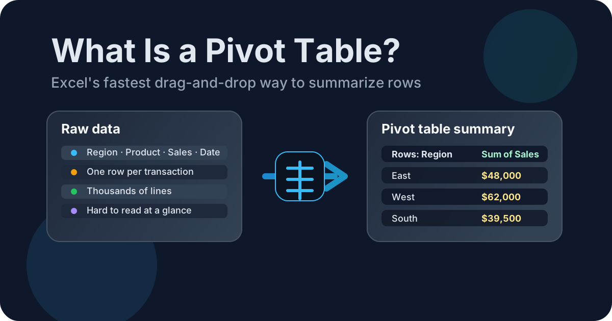
A pivot table is Excel’s fastest way to turn a long list of rows into a short, useful summary. If you have sales data, orders, or any other table with repeated categories, a pivot table lets you ask questions like “How much did each region sell?” or “Which product has the most rows?” without building a pile of formulas first. This is a pivot table explained in plain language: it is a flexible report, not a different copy of your worksheet.
Key takeaways
A pivot table’s value is fast summarization: it turns a long source into a grouped report without changing the underlying rows. That matters at Excel’s scale—Microsoft specifies a worksheet limit of 1,048,576 rows and 16,384 columns—although practical capacity also depends on memory and workbook design. Microsoft’s Excel limits document those figures.
- A pivot table summarizes data by dragging fields into Rows, Columns, Values, and Filters.
- It is best for grouped reporting, not row-by-row calculations.
- You can refresh it when your source data changes.
- Pivot tables are great for date grouping, category comparisons, and quick reporting.

What a pivot table does in Excel
A pivot table groups repeated records and calculates totals, counts, averages, or percentages in a separate report. Microsoft divides its layout into exactly four areas—Filters, Columns, Rows, and Values—so changing the view means moving fields among those areas, not rewriting the source. Microsoft’s Data Model tutorial documents that four-area structure.
In practice, a pivot table can give me:
- totals
- counts
- averages
- minimums and maximums
- percentage breakdowns
- grouped date summaries
If I want to compare categories quickly, a pivot table is usually the cleanest tool in Excel. If I want a precise row-level result, I use a formula instead.
A simple pivot table example
A small example makes the payoff visible: detailed sales rows become one grouped line per region while the source remains intact. The capacity difference between Excel formats shows why summarization matters: Microsoft lists 65,536 rows for .xls and 1,048,576 for .xlsx, a sixteenfold increase. Microsoft’s large-data guidance provides both limits.
| Region | Product | Sales |
|---|---|---|
| East | Widget | 12000 |
| East | Gadget | 9000 |
| West | Widget | 17000 |
| West | Gadget | 15000 |
| South | Widget | 8000 |
| South | Gadget | 11000 |
If I build a pivot table from that data, I can summarize sales by region in seconds:
| Region | Sum of Sales |
|---|---|
| East | 21,000 |
| West | 32,000 |
| South | 19,000 |
| Grand Total | 72,000 |
That is the real value of a pivot table: the raw rows are still there, but the report becomes much easier to read.
Pivot table basics: the mental model
The pivot table basics are easier when you see four movable field areas rather than a formula grid. Microsoft names them Filters, Columns, Rows, and Values, and confirms that rearranging fields does not affect the underlying data. That four-part model explains how one source can answer many questions. Microsoft’s tutorial shows the layout.
The four areas describe a question, not a fixed report design:
Rows
Rows decide what appears down the left side of the report. If I drag Region into Rows, I get one line per region.
Columns
Columns create side-by-side groupings. If I drag Product into Columns, Excel can show me one column per product category.
Values
Values are the numbers I want to calculate. This is where I put sales, quantity, counts, margins, or any other measure.
Filters
Filters let me narrow the report without rebuilding it. If I drag Year into Filters, I can switch the report between time periods very quickly.
The important part is that nothing here alters the underlying rows. Dragging a field changes the way Excel groups and summarizes the information. That is the “pivot”: you can rotate the view from sales by region to sales by product without copying the source data or building a second report from scratch.
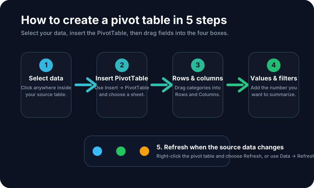
For the complete click-by-click workflow—including selecting the source, choosing where the report goes, and configuring each field—read How to Create a Pivot Table in Excel. If you want a deeper walkthrough of grouped reports after that, see Numbering Grouped Data for Pivot Tables and Excel Weighted Average Pivot Table.
What does a pivot table do for different questions?
The answer to what does a pivot table do is simple: it changes grouped data into comparisons you can filter and rearrange. Microsoft lists a maximum of 1,048,576 unique items per PivotTable field, although practical report size still depends on memory. That capacity makes flexible grouping valuable. Microsoft’s specifications document the limit.
Here are a few practical questions a pivot table can answer:
- Sales performance: Which region, rep, product, or channel contributed the most revenue?
- Volume: How many orders, tickets, customers, or transactions belong to each category?
- Time: How do totals compare by month, quarter, or year?
- Mix: What share of a total comes from each product or business unit?
- Exceptions: Which category has an unusually high count, low average, or missing value?
The fields determine the level of detail. Put Region in Rows and Sales in Values for a regional total; add Product to Columns to compare products within each region. Put Year in Filters when you need the same report for one period at a time. The source stays intact while the question changes.
What Microsoft’s official guidance adds
Microsoft’s official creation guide identifies four starting paths: a table or range, an external source, the Data Model, or Power BI. The practical lesson is that “PivotTable” describes the summary interface, not one source type; the same field-based idea spans local and connected data. Microsoft’s creation guide lists those four choices.
That matters because beginners often think a PivotTable is only for one specific kind of worksheet. In reality, the workflow is flexible enough to handle normal tables, larger data models, and even cloud-connected sources. Refresh behavior now varies by version: Microsoft says newer Excel versions can automatically refresh PivotTables connected to local workbook data, while older versions require manual refresh or a refresh-on-open setting. Microsoft currently labels PivotTable Auto Refresh as a Microsoft 365 Insider feature, so do not assume every installation has it.
The first time through, Microsoft’s interface can feel like a collection of choices. The useful distinction is between the source choice and the report layout. The source choice tells Excel where the rows are; the layout tells Excel how you want those rows grouped. That separation keeps a summary report from becoming a destructive rewrite of the data.
A few concept-level takeaways from the official workflow:
- Use a clean table or range first. That keeps the source easy to refresh and extend.
- Treat the field list as the construction zone. The PivotTable itself is just the output; the pane is where the real work happens.
- Expect to revisit Value Field Settings. Sum is the default, but count, average, and percentage-style summaries are often more useful.
- Check your refresh mode after adding rows. Auto Refresh may handle local workbook changes in supported newer builds; otherwise use Refresh, Refresh All, or refresh-on-open.
Those are small habits, but they make PivotTables feel predictable instead of mysterious.
If you remember only one thing, remember this: the PivotTable is not the spreadsheet itself; it is a view on top of the spreadsheet. That little mental shift makes the tool much easier to trust. Once the source data is clean, the fields are placed correctly, and the report is refreshed at the right time, you can move from question to answer in just a few clicks.
The nice part is that the same workflow scales well. A tiny budget sheet, a five-thousand-row sales export, and a larger model-driven workbook all start with the same idea: select the source, choose the fields, summarize the values, and refine the result until it answers the question you care about.
Common pivot table mistakes
Most pivot-table mistakes come from source hygiene, stale data, or the wrong field placement—not from arithmetic. Scale makes those slips costly: Microsoft’s Data options use 300,000 rows as the default threshold for disabling undo during large PivotTable refreshes. That official default is a useful reminder to validate before refreshing. Microsoft’s Data options guide documents it.
1. Leaving blank rows inside the source data
Excel likes clean, contiguous tables. Blank rows can break the selected range or make the pivot table miss new records.
2. Forgetting to refresh
A pivot table’s update behavior depends on the Excel version, source, and saved settings. Microsoft says new PivotTables connected to local workbook data can have Auto Refresh on by default in supported newer builds, while older versions still need manual refresh or refresh-on-open. If a summary looks stale, check Auto Refresh and then use Refresh or Refresh All.
3. Putting text fields in Values by accident
If I drag a text field into Values, Excel usually counts it instead of summing it. That is fine when I want counts, but it can be confusing if I expected totals.
4. Expecting a pivot table to keep the original order
A pivot table reorganizes the data. If I need the source rows in a specific order, I should sort the source table or use a formula-based approach.
5. Using a pivot table for row-level logic
If I need to calculate something line by line, a pivot table is the wrong tool. That’s when formulas, helper columns, or Power Query are the better choice.
When to use a pivot table, and when not to
Use a pivot table when the question is summary-first and the source has repeated categories; use another tool for row-level logic or rigid presentation layouts. Excel’s maximum worksheet grid is 1,048,576 rows by 16,384 columns, yet a good PivotTable exposes only the groups the reader needs. Microsoft’s specifications provide those limits.
- Which product category sells best?
- How do totals change by month?
- Which region has the highest average order value?
- How many rows belong to each customer segment?
I avoid pivot tables when I need:
- a custom report layout that Excel keeps rearranging
- a formula on every row of the source data
- a report that must stay visually fixed for presentation
- immediate calculations in an Excel version or connection that does not support Auto Refresh
For those cases, formulas often fit better. If I need grouping logic before the pivot table exists, Numbering Grouped Data for Pivot Tables is the next article to read. If I need a more advanced summary calculation, Excel Weighted Average Pivot Table shows the next step.
A quick mental model
The easiest mental model is three verbs: group, summarize, rearrange. Microsoft’s field-list documentation places fields into four report areas, but you do not need four separate techniques: choose a grouping, select the values to summarize, and move fields when the question changes. Microsoft’s PivotTable tutorial confirms the four-area interface.
- Group the rows
- Summarize the numbers
- Rearrange the output into a report
That’s why pivot tables are so popular. They let me answer “what happened?” questions without rewriting the workbook every time I want a different view.
FAQ
The short answers below cover the five questions beginners ask most. One modern caveat matters: Microsoft provides two controls for Auto Refresh—the PivotTable Analyze tab and PivotTable Options—and currently limits the feature to Microsoft 365 Insiders. Microsoft’s refresh guide explains both controls and the availability note.
What is a pivot table in simple terms?
A pivot table is a summary table. It takes many rows of data and rolls them up into totals, counts, averages, or comparisons that are easier to read.
What is the difference between a pivot table and a formula?
A formula usually calculates one result at a time. A pivot table groups a whole dataset and calculates summaries automatically. If I need row-by-row logic, I use formulas; if I need a summary view, I use a pivot table.
Can pivot tables handle dates?
Yes. Pivot tables can group dates by month, quarter, or year, which makes trend reporting much easier than sorting dates manually.
Do pivot tables update automatically?
It depends on your Excel version and settings. New PivotTables connected to local workbook data can use Auto Refresh in newer Microsoft 365 Insider builds; older versions and other configurations still need a manual refresh or refresh-on-open setting.
When should I not use a pivot table?
I skip pivot tables when I need row-level calculations, a very specific fixed layout, or immediate updates in a version or connection that does not support Auto Refresh. In those cases, formulas, Power Query, or another reporting tool may fit better.
Next step
Build one report next: Microsoft’s standard field list has four areas, but a first PivotTable needs only a category in Rows and a number in Values. Use the step-by-step pivot table tutorial for the clicks, then deepen the workflow with grouping or weighted averages. Microsoft’s tutorial verifies the four-area layout.
