
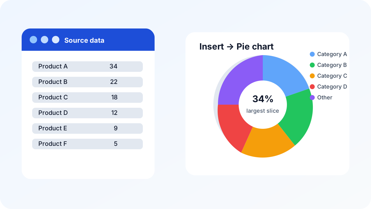
If you need the short answer, here it is: select your category names and values, choose Insert > Pie, and then turn on data labels so readers can see the percentages. That is the fastest way to make a pie chart in Excel without overthinking the design.
Charting benchmark: Microsoft recommends a pie chart for one data series with no negative values and no more than seven categories. This article’s six-category example stays within that limit. Source: Microsoft Support, “Add a pie chart” (accessed July 23, 2026).
The real goal is not just to create a pie chart. It is to make a pie chart that people can read in two seconds. In Excel, that means a clean data range, a sensible number of slices, clear labels, and a firm decision about whether a pie chart is even the right chart in the first place.
What is the fastest way to make a pie chart in Excel?
The fastest way is to start with one label column and one value column, select the whole range, and insert a standard 2-D pie chart. If Excel guesses the wrong layout, you can still fix it quickly in the Chart Design and Format tabs, but the starting point should always be a clean two-column range.
A good first pie chart answers one simple question: how does one total split across a handful of parts? If your data is trying to answer three questions at once, the pie chart is already doing too much.
Here is the basic workflow:
- Put categories in one column and values in the next.
- Make sure the values add up to a meaningful total.
- Select both columns.
- Choose Insert > Pie or Doughnut Chart.
- Pick the standard 2-D Pie option.
If you want a chart that feels more polished and easier to explain, keep the colors distinct and add labels right away. You do not need heavy styling to make the chart useful. You need clarity.
How do I prepare the data first?
The best pie charts come from the simplest data ranges. If the source data is messy, the chart will be messy too. Before inserting the chart, make sure the categories are unique, the values are numeric, and the range does not include subtotal rows or blank records that would confuse Excel.
For example, this structure works well:
| Category | Value |
|---|---|
| Product A | 34 |
| Product B | 22 |
| Product C | 18 |
| Product D | 12 |
| Product E | 9 |
| Product F | 5 |
That format gives Excel exactly what it needs: a label for each slice and one number per slice. If you have multiple columns of metrics, pick the one number that actually belongs in the chart. Pie charts are not a good place to stuff in extra dimensions.
A few preparation rules save time later:
- Keep the labels short if you can.
- Remove duplicate categories before charting.
- Sum related rows first if the chart should show grouped categories.
- Check that the values are positive, because pie charts represent parts of a whole.
If the values do not add up to a meaningful whole, the chart will still render, but the story becomes harder to trust.
How do I insert the pie chart in Excel step by step?
Once the data is ready, inserting the chart takes less than a minute. The important part is choosing the right pie variant and then confirming that Excel used the correct labels and values. After that, you can format the chart without changing the underlying logic.
Use this workflow:
1) Select the source range
Highlight both the category labels and the values. If your data is in an Excel Table, you can often select the two columns directly and Excel will preserve the structure better as rows change.
2) Insert the chart
Go to Insert and choose Pie or Doughnut Chart. Pick the standard 2-D pie chart first. That is the most readable version and usually the best default.
3) Check the series orientation
If the chart looks backwards or starts on an odd slice, open the chart data settings and confirm that Excel is using the right labels and values. The slices should match your categories in a logical order.
4) Add the chart title
Give the chart a direct title, such as Revenue share by product or Traffic share by channel. A chart title should explain the point of the chart, not just repeat the chart type.
5) Add data labels
Turn on labels so the chart is useful without hovering. Most pie charts need at least percentages, and many need category names too.
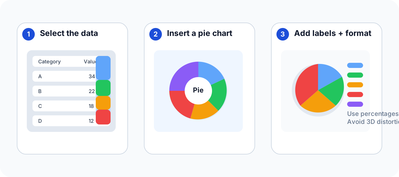
If you are documenting the chart for a report, this is also the moment to make the design consistent with your spreadsheet theme. Use the same font family, keep the palette restrained, and avoid unnecessary visual effects.
How do I show percentages on a pie chart in Excel?
The easiest way to show percentages is to add data labels and then format them to display percentage values. Excel can show the category name, the raw value, and the percentage at the same time, but that is only helpful when the chart remains readable. Too many label types can make the pie crowded.
To add percentages:
- Click the pie chart.
- Open the chart elements or data label settings.
- Turn on Data Labels.
- Open Format Data Labels.
- Check Percentage.
- Add Category Name if the chart still reads cleanly.
If your slices are tiny, percentage labels can overlap. In that case, you may want to remove the smallest slice labels and use a callout or table note instead. The chart should help the reader compare parts, not force them to decode a wall of numbers.
A useful trick is to sort the values before charting. When the largest slice appears first, readers can understand the chart faster, and the visual order often feels more natural.
If you need a deeper primer on choosing chart types and making data easier to understand, our guide to data visualization and why graphs make complex financial data accessible is a good companion read.
How do I format slices, colors, and labels so the chart is easier to read?
The best formatting choice is usually the simplest one: keep slices flat, assign each category a distinct, accessible color, and add labels large enough to read without zooming. Use a restrained palette and avoid decorative effects, because busy colors, gradients, and tiny labels make the comparisons a pie chart is meant to show harder to follow.
A few formatting choices make a big difference:
- Explode one slice only when it matters. Use this to highlight a single category, not to decorate every chart.
- Keep the number of colors small. Distinct is better than flashy.
- Avoid hard gradients and shadows. They add noise without improving comprehension.
- Use a title that says what the chart shows. Readers should not need to guess.
- Put the largest slice near the top or start position when practical. It makes the chart feel easier to scan.
When the chart is going into a slide deck or report, I usually test it at a smaller size. If the chart still reads clearly when shrunk down, the formatting is probably good enough.
If you need a more structured visual workflow for charting in Excel, the logic is similar to our Excel chart drop-down guide: make the data clean first, then choose the chart that best supports the story.
Should I use a 3D pie chart or pie of pie chart?
Use 2D pie charts for most comparisons, because 3D perspective can visually distort slice sizes and make differences harder to judge. A pie-of-pie chart can help only when several small categories need separating, but it should still be labeled clearly so readers can understand exactly what has been moved into the secondary pie.
Use a flat 2-D pie chart when the goal is a quick part-to-whole comparison. Use a pie of pie chart only when one or two small slices are getting lost and you need a second breakdown to make them visible. That second chart can help, but only if the chart remains easy to explain.
A pie of pie chart is most useful when:
- one group dominates the chart,
- several small categories are crowded together,
- and you still want to keep a single visual rather than splitting the story into a separate chart.
If the chart has too many small slices, though, a pie of pie chart can feel like a workaround. At that point, a bar chart or column chart often communicates the same information more clearly.
As a rule, ask yourself whether the reader needs to compare lengths or just see proportions. If they need precise comparison, use a bar chart. If they need a simple share-of-total view, the pie chart is fine.
What are the most common pie chart mistakes in Excel?
The most common mistakes are usually design mistakes, not technical ones. People choose too many slices, use inconsistent colors, stack labels until they overlap, or force a pie chart to explain data that should have been a bar chart instead.
Watch out for these problems:
- Too many categories. If the pie looks crowded, stop and simplify.
- Negative or zero-heavy data. Pie charts are meant for parts of a whole, not mixed-sign data.
- 3D distortion. It looks dramatic but weakens readability.
- Unreadable labels. If the label text is tiny or overlapping, the chart is failing.
- Bad ordering. Random ordering makes the chart harder to scan.
If the chart is not obvious within a few seconds, your first fix should be to reduce complexity. Delete unnecessary slices, sort the values, and keep only the labels the reader truly needs.
The same rule applies when a chart is part of a broader dashboard. The visual should support the report, not compete with it.
When should I use a different chart instead of a pie chart?
You should switch to a different chart whenever the reader needs to compare similar values precisely or when the chart has too many categories to stay legible. A bar chart is often better for ranked categories, and a column chart is usually better when the values need a stronger comparison structure.
A pie chart is the right choice when:
- the data is a simple part-to-whole breakdown,
- the number of slices is small,
- and the reader only needs a quick visual impression.
A different chart is better when:
- the values are close together,
- the chart needs many categories,
- or the reader must compare changes over time.
That is why pie charts work best as summary visuals. They are fast to understand, but they are not a universal answer. If you are building a report with lots of detail, a bar chart often communicates the same idea with less effort.
FAQ
Start with one label column and one value column, select both, then choose Insert > Pie or Doughnut Chart > 2-D Pie. Add category and percentage labels only while they remain legible. Use a pie for a small part-to-whole story; choose a bar chart when readers need precise comparisons.
How do I make a pie chart in Excel?
Select your category labels and numeric values, then choose Insert > Pie or Doughnut Chart and pick a 2-D pie chart. After that, add labels and format the title and colors so the chart is easy to read.
How do I show percentages on a pie chart in Excel?
Add data labels, open Format Data Labels, and select Percentage. If the chart still reads cleanly, add the category name too.
Should I use a 3D pie chart in Excel?
Usually no. A 3D pie chart can distort the slices and make the chart harder to read. A flat 2-D pie chart is clearer.
When should I use pie of pie?
Use pie of pie when the smaller slices are getting lost in the main chart and you want a second breakdown without creating a separate chart.
What is the best alternative to a pie chart?
A bar chart is usually the best alternative when the reader needs to compare categories precisely or when the data has too many slices.
Final takeaway
The simplest way to make a pie chart in Excel is also the best way: keep the data clean, use a flat 2-D chart, show percentages, and avoid crowding the design. If you can explain the chart in one sentence, the chart is probably doing its job.
If you are deciding between chart types, the pie chart is best for a small part-to-whole story. If you need stronger comparisons or more detail, move to a bar chart instead.
