
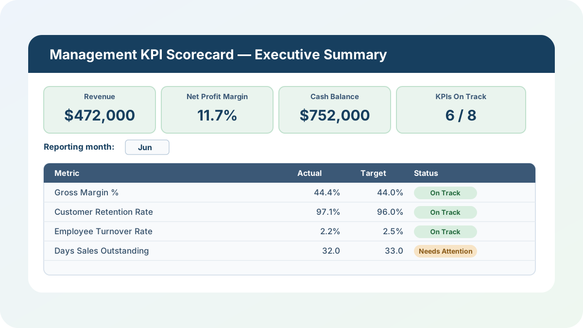
I review a lot of monthly reporting packs, and the same failure mode shows up constantly: the finance team has a P&L, HR has a headcount report, and customer success has a churn number, and somebody spends the first hour of the leadership meeting just reconciling which numbers are current. This management KPI scorecard is my answer to that — one workbook where eight executive-level KPIs across finance, customers, people, and cash all calculate from the same twelve months of inputs, with a single month selector that drives both the detail grid and a one-page executive summary.
Download the management KPI scorecard — it’s a plain .xlsx, no macros, no external data connections, and no sign-up. Open it in Excel or Google Sheets and start replacing the sample numbers with your own.
Who is this template for?
I built this for a founder, controller, or department head who reports to a leadership team or a board and is tired of stitching together a KPI deck by hand every month. If you can pull revenue, cost of goods sold, operating expense, net income, customer counts, headcount, cash balance, and accounts receivable out of your existing systems, this workbook turns those raw numbers into eight ratios, flags which ones are off target, and gives you a one-page executive summary you can screen-share without any extra formatting. It’s also a clean teaching example of how a month selector can drive two different views of the same underlying data with INDEX/MATCH.
One thing this scorecard deliberately is not: a floor-level operations dashboard for any single department. This is an executive roll-up — the kind of scorecard a CEO or a board reviews, not the kind a shift supervisor uses to run day-to-day operations.
What’s in the workbook, sheet by sheet
The workbook ships with six sheets, in this exact order, because each one builds on the sheet before it:
- Instructions — a short setup guide plus a clean-room disclosure: every formula, layout, and sample figure in this workbook was authored from scratch for Excel.TV. No vendor workbook, template, branding, or dataset was downloaded, inspected, or adapted to build it.
- Metric Definitions — a reference table documenting all eight KPIs: what each one means, exactly how it’s calculated, its unit, whether higher or lower is better, and which Monthly Inputs columns feed it. Nothing on this sheet is editable; it’s there so a new reader can understand the scorecard without asking you.
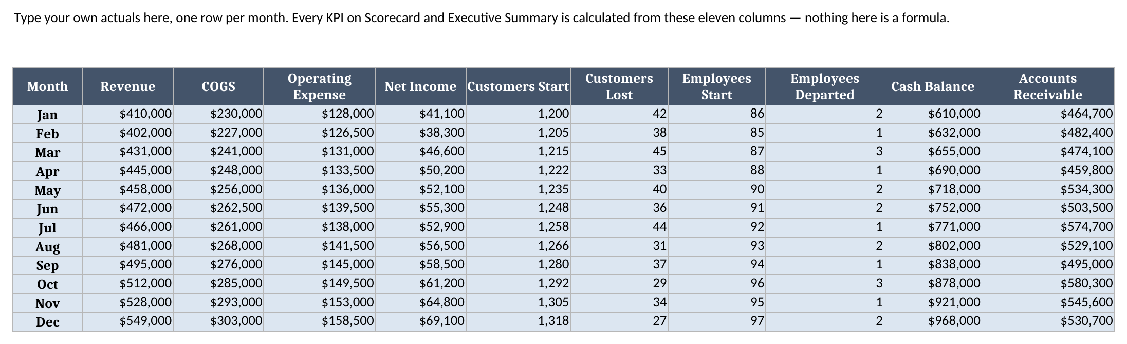
- Monthly Inputs — the only sheet you type raw numbers into. Twelve rows, one per month, with revenue, cost of goods sold, operating expense, net income, customer counts, headcount, cash balance, and accounts receivable. Every ratio downstream derives from these eleven columns.
- Targets — one target value and one direction (Higher is better / Lower is better) per KPI. This is what the Scorecard’s status column compares against.
- Scorecard — all eight KPIs calculated for all twelve months, plus a month selector and a per-KPI Actual/Target/Variance/Status readout for whichever month you’re reviewing.
- Executive Summary — the one-page leadership view: four headline cards, the full eight-KPI status table for the selected month, and a count of how many KPIs are on track.
The required inputs are the eleven Monthly Inputs columns and the Targets sheet. The main outputs are the eight calculated KPIs, their On Track / Needs Attention status, and the on-track count on Executive Summary — all of which recalculate the instant you change an input cell or flip the month selector.
How do I set up the management KPI scorecard?
- Open Monthly Inputs and replace the twelve sample rows with your own actuals — revenue, COGS, operating expense, net income, customer counts, headcount, cash balance, and accounts receivable for each month.
- Open Targets and set the target value and direction for each KPI. The direction dropdown only accepts “Higher is better” or “Lower is better,” which is what keeps the status logic honest — a metric like Operating Expense Ratio needs the opposite comparison from Revenue.
- Open Scorecard and use the month selector at cell B2 to choose which month to review. Every KPI’s calculated value for all twelve months stays visible in the grid to its left; the Actual, Target, Variance, and Status columns on the right update to match your selection.
- Open Executive Summary for the same selected month’s headline cards and full status table, ready to present.
- Review any KPI marked “Needs Attention” first — that’s the whole point of the status column.
Because Metric Definitions and Targets both use the exact same eight KPI names as Scorecard, every lookup in the workbook keys off plain text matching, not row position — so as long as a metric name is spelled identically across sheets, you can reorder the Scorecard rows without breaking anything.
How the month selector and the status column actually work
This is the mechanic I’d point to first if you want to understand the whole workbook. Scorecard’s month selector at B2 is a plain data-validation dropdown, but it drives an INDEX/MATCH lookup across each KPI’s row of twelve calculated monthly values, pulling out just the selected month’s number into the “Month in Review Actual” column. That same selected-month actual then gets compared against a target pulled from the Targets sheet with a second INDEX/MATCH, and a third lookup pulls that KPI’s direction.
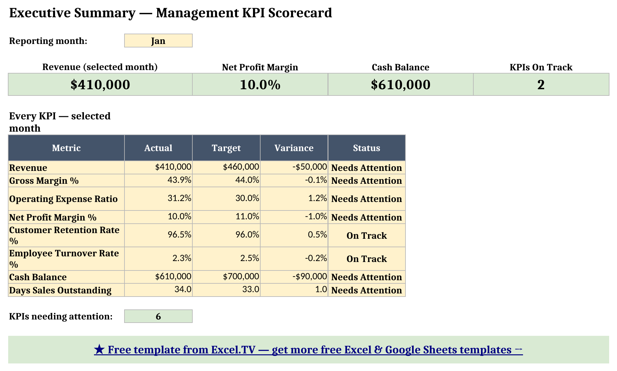
The status formula itself is one IF: when direction is “Higher is better,” actual greater than or equal to target reads On Track; when direction is “Lower is better,” actual less than or equal to target reads On Track. Everything else reads Needs Attention. Looking at the screenshot below with January selected, six of the eight KPIs read Needs Attention — Revenue came in under target, Gross Margin was a hair light, Operating Expense Ratio and Days Sales Outstanding both ran over their thresholds, and Cash Balance hadn’t yet built up to its target. Only Customer Retention Rate and Employee Turnover Rate were On Track that month. That’s a realistic January for a growing business — spend ahead of revenue, cash still building — and it’s exactly the kind of pattern a scorecard is supposed to surface at a glance instead of burying in a spreadsheet full of numbers.

Worked example: reviewing January
Here’s what the workbook calculates for January, pulled straight from Scorecard and Executive Summary after a full recalculation:
| KPI | Actual | Target | Status |
|---|---|---|---|
| Revenue | $410,000 | $460,000 | Needs Attention |
| Gross Margin % | 43.9% | 44.0% | Needs Attention |
| Operating Expense Ratio | 31.2% | 30.0% | Needs Attention |
| Net Profit Margin % | 10.0% | 11.0% | Needs Attention |
| Customer Retention Rate % | 96.5% | 96.0% | On Track |
| Employee Turnover Rate % | 2.3% | 2.5% | On Track |
| Cash Balance | $610,000 | $700,000 | Needs Attention |
| Days Sales Outstanding | 34.0 days | 33.0 days | Needs Attention |
Executive Summary’s four headline cards for that same month show Revenue at $410,000, Net Profit Margin at 10.0%, Cash Balance at $610,000, and 2 of 8 KPIs On Track — every one of those numbers is a formula reading from Scorecard, not a typed-in figure, so the headline cards and the detail table underneath them can never quietly drift apart.
Flip the Scorecard month selector to a later month in the sample data and you’ll see the story improve — revenue climbs, cash builds past its target, and Days Sales Outstanding tightens as collections improve, which is exactly the kind of trend a scorecard should make visible without a separate trend chart.
How do I use this in Google Sheets?
Google Sheets is a first-class destination for this template, not an afterthought. Open Google Sheets, choose File > Import > Upload, select the downloaded .xlsx, and pick “Insert new sheet(s).” Every formula in this workbook — SUM, IF, IFERROR, INDEX, MATCH, and COUNTIF — is natively supported in Google Sheets, so nothing needs to be rewritten, and the month-selector and direction dropdowns’ data validation carries over with the import. There’s nothing further to configure; the scorecard behaves identically to the Excel version from the moment it finishes importing.
How this differs from a generic finance dashboard template
Excel.TV also publishes a Finance Dashboard Template and a Budget vs Actual Template, and it’s worth being clear about where this one fits next to them. Those two are built around a single discipline — a monthly close, or a budget-to-actual variance review — with one owner and one audience. This management KPI scorecard is deliberately cross-functional: it pulls one KPI each from finance, customers, people, and cash into a single status view, on the theory that a leadership team doesn’t want four separate dashboards, it wants one page that tells it where to look first. If you only need a finance close or a budget variance review, those narrower templates will fit better and go deeper on that one topic. If you need the one-page version that a board sees, this is the one built for that job.
Limitations to know before you rely on this
A few things are worth knowing before you put real numbers in:
- One target per KPI, not a month-by-month target curve. Targets holds a single value per KPI that applies across all twelve months. If your business has a target that ramps through the year — a revenue target that grows every quarter, for instance — you’ll want to average or otherwise flatten that into one representative number, or extend Targets into a month-by-month table and update the Scorecard lookup formulas to match.
- Days Sales Outstanding is a simplification. It’s calculated as accounts receivable divided by a 30-day average daily revenue for that month, which is a reasonable estimate but not the more precise rolling-90-day DSO some finance teams calculate.
- Metric names must stay identical across sheets. Scorecard, Targets, and Executive Summary all look up KPIs by matching the exact text of the metric name. Rename a KPI on one sheet without renaming it everywhere and that lookup will come back blank.
- No macros, no external connections. Everything here is a native formula. That’s deliberate — it’s what keeps the workbook portable between Excel and Google Sheets with zero substitutions.
I’d rather flag these up front than have you discover them mid-board-meeting. Once you know the one-target-per-KPI rule and the DSO approximation, the rest of the workbook takes care of itself.
Download the management KPI scorecard and start replacing the sample inputs and targets with your own — the month selector, the status column, and the executive summary will all follow.
